one Screen resolution width
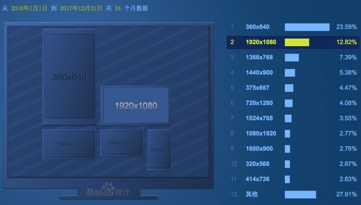
We only look at the PC side, according to the distribution statistics of the current screen size (below The figure is )

Website construction In the process, the resolution of most screens has exceeded 1366 * 768, which is a trend that the screen is getting larger. A few years ago, we still need to consider the display effect under the very common resolution of 1024 * 768, but now we don't need to deal with it alone.
This resolution value is only a reference to the upper limit. It is impossible to get this value for the actual display content area (or the security area) of the page, because in some browsers such as Windows, scroll bars should also occupy the width, and excessive welting is not recommended in design.
By understanding this, we can clearly know the reference range of a reference value.
two Grid and responsive design
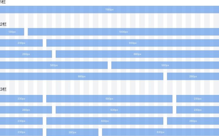
Here we need to understand a concept. Usually, for layout convenience, we divide the content area into 12 or 24 grids, and add a common spacing between grids to deal with vertical arrangement in most cases. The advantage of 12 or 24 is that it can be divided by 2, 3, and 4, and it is more convenient to deal with common spacing such as 2:1, 1:2:1.

Calculation method (I usually deal with enterprise level design pages)

At this point, we basically know why our common value is 1180 (1200 minus the blank on both sides of the grid). This value is called typical design reference. Previous design drafts cannot dynamically adapt to various widths. Using typical values as design draft reference dimensions can express typical effects, and can be easier to restore during page implementation.
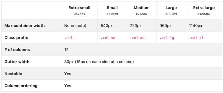
Responsive layout is a popular concept in recent years. When rendering a web page, it can automatically rearrange Layout and page elements according to the window width. Introduction to the more common Bootstrap responsive part:
And a detailed description of the grid part:
The following figure shows several typical values in the common screen state of Bootstrap:

You can also refer to the more classic design specifications above for font size of web pages. The common text size of content paragraphs is 14px. The specifications I am working on are as follows:
