It's a big mistake to think that responsiveness can solve all problems
According to relevant data, currently about 11% of websites are responsive, and the number is still growing. Even so, we should also have a basic understanding of responsive design: responsive design is great, but not a master key. Since 2000, designers and developers have oversimplified the problem of mobile devices, so that some people still believe that responsive web design can solve all problems.
If you persist in responsive design on mobile devices, performance problems may be hidden after the conversion rate. According to Guy Podjarny's research, 72% of responsive websites provide the same bytes regardless of screen size, which will inevitably reduce the speed of mobile network connection. You should be clear that not all users have the patience to wait for the website to load, or they will shut down the website before they feel the performance of responsive design on different screens.
It is difficult to achieve the best mobile presentation effect just considering the screen size
In the mobile era, responsiveness can solve the problem of cross desktop and mobile end window size range. But just considering the screen size underestimates mobile devices. Because now, the boundary between desktop and mobile is becoming blurred, and there are still many possibilities for us based on different devices. For example, different devices render in different ways, and great pages on the iPhone may perform poorly on other platforms.
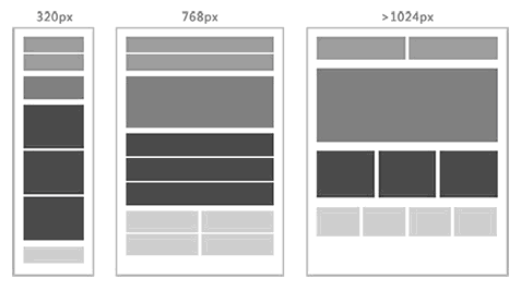
Responsive design is a method of adaptive website content, design and navigation based on the desktop website according to the size and resolution of the device screen. It has strict requirements on the layout of the website. Only the page layout in fluid grid format can be captured to achieve responsive design effects. Therefore, responsive design is a mobile solution mainly for front-end pages.
For the mobile website, it is a compromise design solution, because it can not be flexibly changed and adjusted specifically for mobile devices through the background, and because of strict design requirements, it will be difficult to achieve the best presentation effect due to various factors. If you don't believe me, let's take a look at some typical examples:
Example 1: Menu line folding
If a navigation bar is used at the top of the PC side page, when the page is displayed on a small screen, responsive design will usually "break" it into a more compact format, but this is not always effective. If the display area is wider than the breakpoint, and is not enough to display all menu items in one line, the result will be a folding of the menu.

Example 2: Pictures are cropped
In responsive design, the content area usually changes with the size of the window. So when a website uses a fixed width image, when the image exceeds the display area, the image will be cropped, as shown below. Because the image is too large, a scroll bar appears and the content is pushed out of the screen.

Example 3: Element distortion
Essentially, when the layout is displayed on a small window, all unprocessed columns are presented in rows. This is a problem, because the distortion of content will inadvertently change the level of design, and to some extent, change the original layout of the website, which will lead to user confusion.

Not flexible enough, small changes will cause "big trouble"
When a responsive website navigation is just displayed in one line, do you know what will happen if you need to add a new navigation category, content chapter, or translate the navigation title into other languages, resulting in character length changes? you 're right! These situations will destroy the original design scheme. For example, the navigation will be crowded together, which will kill those "thick fingers". Because on the small screen, you can't click the navigation chain you want to access, which greatly increases the probability of misoperation.
More seriously, this may mean that the previous website design may have to be overturned and revised, and this is only because you want to make some small changes on the original website.
At the moment when performance decides everything, mobile network experience must be as fast as lightning. A fast, practical, and compatible experience is a challenge for all mobile devices. These challenges exist when you use responsive design. Quote Ethan Marcotte: "The most important thing is that responsive web design is not intended to replace mobile web pages." Responsive design never means to solve "performance". However, it is a big mistake to believe that it can solve all your problems. If we can use some other technologies, we can achieve the benefits of responsive design without affecting the performance of mobile devices, which is ideal.
Source of this article: Shangpin China


