The priority of mobile web pages has become a popular trend in the current information age. With the development of mobile technology, there have been several updates, and a large number of incompetent mobile web pages still exist. Mobile users tend to have a more specific purpose. Usually, they want to get the information and content they want from mobile pages clearly and easily. Whether browsing shopping, online news, or magazine subscription information, mobile web pages should provide them with a seamless user experience as far as possible. So what should we do to make a beautiful mobile web page? Take a look at these suggestions. Do you have any inspiration?

Comprehensive optimization for mobile terminals
The primary obstacle for desktop web pages on mobile devices is the use of navigation. In short, the optimized mobile pages are cleaner and have easier navigation CTA buttons. The following are some practical tips for optimizing mobile pages:
1. Use vertical scrolling only. Do not use horizontal scrolling, so that users can only scroll in one direction to browse the main content. Try to control the page width, position and image zoom through CSS.
2. Put your content first and avoid distractions from other elements.
3. Do not mix mobile pages with desktop pages.
.jpg)
Keep menus short and easy to use
The detailed and comprehensive menu design works well on the desktop, but when it appears on the mobile end, the menu is too long, and it is difficult to find the desired content. Therefore, you need to consider using a streamlined menu, keeping only the most important and necessary items. According to past experience, try not to make the menu more than 7 items. At the same time, you should keep your menu directory easy enough to use:
1. It should be based on ranking according to importance and value.
2. It should not contain terms that users do not understand, and the menu should use the easy to understand expression _ mobile version of website group.
Highlight search box
If search is the main function of your website, you should highlight this function when doing mobile page optimization, because it is a function with high conversion rate. It is necessary to ensure that it is conspicuous enough. When users want to obtain specific functions, they tend to use the search function. Therefore, search should be a control that users can see as soon as they open the page. Generally, the search box should be placed at the top of the page in the form of a text input box.
Make the call to action button friendly and easy to use on the mobile terminal
Users often ignore some elements on the mobile end page, so try to use the CTA button to ensure that users will not miss them. Different from the desktop side, you need to place the CTA button in the main and prominent position to ensure that they are easy to find and click. The CTA button should be easy to click and will not interfere with or interfere with other elements in the page.
Use high-quality materials
All pictures, videos and UI elements in your website are part of your product. When you optimize pages for mobile terminals, they are important components. Their quality directly affects the user's perception of the mobile version of the website group.
Make the website browse without zooming
The most frustrating thing about desktop web pages appearing on mobile devices is that they need to be scaled. It is not only difficult to read the page without zooming in, but also easy for users to miss important details. To zoom in and browse, you need to drag and drop back and forth. This problem does not exist in the optimized pages for mobile terminals. The image, font and page width are just right, and users can get complete information, ensuring the most basic usability and ease of use.
Accurately master button size

If your page is designed for mobile terminals, the size of buttons in the page should match the size of fingers. Through research, MIT's Touch Lab found that the average touch size of the finger surface is 10-14mm, while the average size of the fingertip is 8-10mm, which means that the control size design of 10mm x 10mm is relatively reasonable. Another consideration is the distance between the fingertips of touchable controls. If the two buttons are relatively close, users are prone to touch them by mistake on the mobile terminal. If you want to solve this problem, you need to readjust the size and the distance between buttons according to the actual situation to meet the needs of user finger interaction.
Let the user complete the operation in a browser window
Switching between windows of smart phones is more troublesome than that of the desktop, and the risk that users cannot find the original page is real. Try to let users complete all browsing and operations in one window, simplify processes and complex interactions, and let users stay in one place all the time.
Let users explore before making a decision
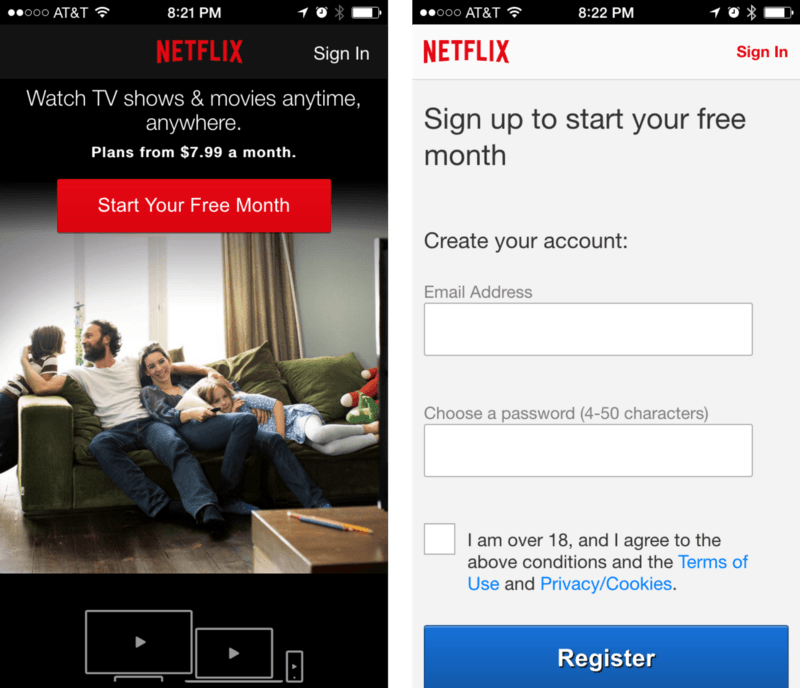
It is against the principle of mutual benefit to ask users to register without knowing your website. Data once showed that more than 85% of users chose to give up and leave due to early registration.

EtFlix once gave users a free trial for one month, but users need to register before using this benefit. Generally speaking, before providing personal information registration, users will browse the content of the website, understand what type of the website and what services it provides, and then make a decision to educate the website group. Therefore, to break the barrier of conversion rate, you need to do the following two things when designing websites: 1. Provide experience process that can be completed without login
2. Registration is required only when users are required to provide relevant information, and users are required to provide as little data as possible
Inform the user to select a more reasonable screen direction
Users' browsing experience will be completely different in different screen directions. Users are accustomed to completing all operations in the same screen direction, so reminding them to switch directions can improve the user experience of website browsing.

Convenient switching between devices
Not all users are accustomed to browsing on the mobile end. Some users are just accustomed to searching information on the mobile end. Therefore, you should provide a simple method to save information so that they can be used across devices. When users leave mobile devices, they can also browse and view secondary vocational website construction on the desktop.
1. Ensure that users can save information by sharing or sending email/social media.
2. Save entries as favorites.
Let the picture enlarge and expand
When users browse the web, they always want to see the configured picture as a large high-definition picture without code. If they cannot zoom in, users' frustration will directly affect their desire to continue browsing. Therefore, it is necessary to provide high-quality product maps and add the zoom function, so that users can see the details of the secondary vocational website group.
What is the concept of "mobile friendly" we often say? A recent Google study found that websites optimized for mobile terminals are more likely to win repeat customers. If you want your website to be easily accessible on mobile devices, you should focus on eliminating the usability problems that may exist on all mobile devices.

.jpg)


.jpg)

