Low profile color scheme
Most websites come from a basic grayscale - white background and black text. Different colors are what you can see. That's why websites are not full of color. They use them to show you buttons, titles or links.
Color is a very interesting test in website design. Most websites look more or less similar, but color design means many differences. Imagine a world where every website is colorful. It may be very beautiful, but it is not prominent. Therefore, the color scheme gives it many opportunities to express itself.
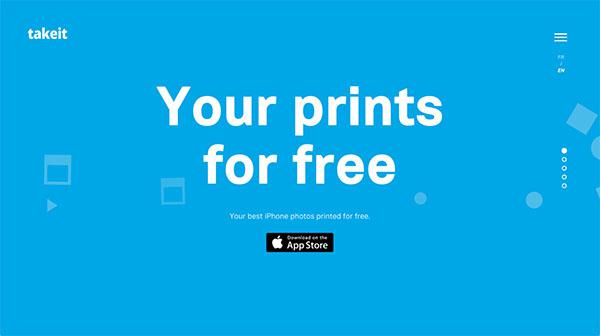
Another example is Takeit; When you first login to the homepage you have a big blue background. However, the others are white. The front and center of the headline are also the focus of attention. Soon your eyes noticed the small but still obvious App Store button. This is the color that can guide users' attention.
Create design image
Color is wonderful because it can set the tone and mood of a website or brand. A service created project briefs and their website started with a lighter tone of earth. When you scroll down their homepage to see the pleasant shades of brown, charcoal, green, and even pink. Secular colors look professional and elegant, which represents a good impression of the company.

Important statement of design
Making a statement through color can be very interesting. You have to make sure that the colors stand out and grab the user's attention, which is very simple. However, the color must also be selected through the statement. You can't choose any neon color, it must be related to the purpose of the whole page and its appearance and feeling.
Landing Page Gaga Symphony. When you log on to their website, you have a bright pink background. This is not the symphony you expected. On the contrary, you want the peaceful color symphony to be considered more elegant. But it's not this one. Gaga Symphony is energetic, interesting and creative. Therefore, pink is meaningful.
Color hidden in the picture
When you find an interesting trick, use the color in the picture well. UI elements are not the only websites that can add some colors. With the rise of photo backgrounds and large landing pages on the product image is a good idea to try to use composite image colors for your design.


