Beijing website construction Shangpin China: With the threshold of website construction getting lower and lower Website production Web design companies, studios and individuals are all crowded in the big pool of the entire network, which is really more wolf than sheep. But now, there are more and more smart "sheep". As far as the author is concerned, the most common and troublesome sentence is - I want to be more generous
So what exactly is atmosphere, and how is the atmosphere website developed? Take ordinary enterprise display sites as examples, sort out some materials and explain them, and welcome your comments.
First: Design color
First, the figure above:
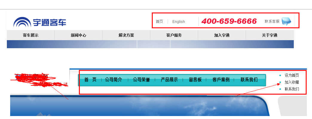
Figure A (Yutong Group site)
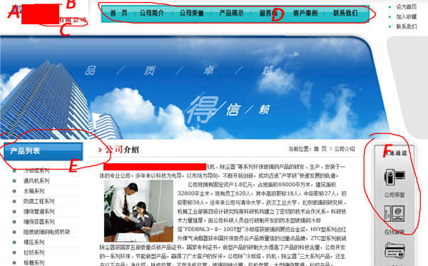
Figure B (website of a glass company)
Comparing the two pictures, we can find that:
A color - light gray (B color is the color used for pictures) appears on the whole page of Figure A. The navigation switch uses red, and the whole website basically uses these two colors to match, making it clean and tidy. This has one of the most important characteristics of the so-called grand website: simple design and color use, not messy; At the same time, the combination of red and gray is also a more enthusiastic combination in chromatics.
Figure B The whole page uses as many as six or seven colors. Although there is no taboo of red with green, this kind of page is easy to give people a sense of disorder, which makes the website look flat and ordinary;
Color is the core and key part in the process of website construction, which directly determines the effect of the webpage to a large extent.
Second: Layout structure
Structure:
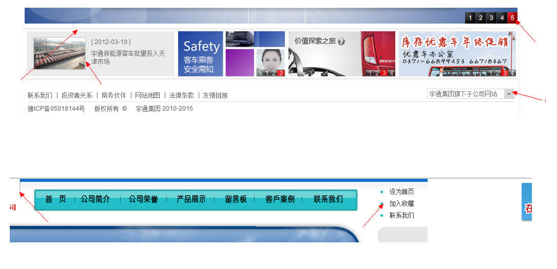
Figure C
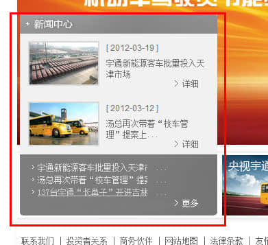
Website A is a combination of navigation, slides, four pictures at the bottom, and feet. In design, it does not occupy a large area to fill text and build sub section areas;
B The overall layout of the website does not have any regularity, and there is no obvious feature in the structure. The design of the layout page structure should not be well conceived, and the overall appearance is very ordinary;
Details:
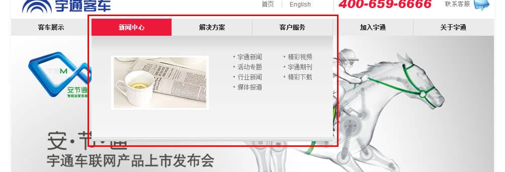
Figure D
Figure A is good at handling some details, which is not ignored because of its simplicity and conciseness. This is also a feature of the atmospheric website: simple and not rough;
B diagram is very rough. LOGO design, banner pictures and other elements that are most easy to set off the beauty of the web page are weakened, which greatly reduces the function of important elements in website construction, but the web page appears rough;
Third: Functional Features
As can be seen from the above figure, although the A figure is simple, there is no lack of effort in relevant special effect design, including functional design, element processing, content presentation, etc.:
On the contrary, the whole page of Figure B is paved in the form of ordinary HTML without any effect display, which can only bring aesthetic fatigue to customers and weaken the company's image invisibly.
The above three points are the author's views on the design elements that account for a large proportion in the website construction process. At the same time, the author believes that although the website construction market is becoming more and more chaotic, it still supports some of the technical elite teams, who are extraordinary in terms of design style, code simplicity, and program rigor, It is their existence that makes classic websites in the Internet emerge in endlessly.
This article was published on Beijing website production Company Shangpin China //ihucc.com/
