MENU service case
 Website construction website design Beijing website construction high-end website production company Shangpin China
We create by embracing change
360 ° brand value__
simplified Chinese character
Simplified Chinese English

Shangpin China Joins Hands with Beisheng Internet to Create a New Chapter in Website Construction

Type: Shangpin Dynamic Learn more

The style orientation of web design

Source: Shangpin China | Type: website encyclopedia | Time: July 23, 2014
Web Design When designing web pages, users should realize different functions and express different themes according to the nature of the site and the requirements of users. From this task category, websites can be divided into the following three categories.

(1) Information websites
Such as Sina, Netease, Sougu and other portal websites. Such websites generally provide users with a large amount of information and a large number of visitors. Therefore, the information should be reasonably classified, and the page should be divided into multiple columns. The page structure should be reasonable, beautiful, and easy for users to browse.

(2) Image websites
Such as the websites of some small and medium-sized companies or units. Such websites are generally small, some only have a few pages, and the functions to be realized are relatively simple. The main task of webpage design is to promote the corporate image. For such websites, layout, color and animation design are the key points of the project.

(3) Website combining information and image
Such as websites of large companies or universities. Such websites have high requirements in design. They should not only consider the indicators of information websites, but also highlight the image of enterprises and units. According to the different functions of websites, they can also be divided into portal, information, entertainment, e-commerce, transaction, enterprise, government, personal homepage and other categories.

Example of website appreciation: portal website appreciation
Portal websites are mainly sites that provide information search, website registration, indexing, online navigation, online community, personal email and other services for online users, and classify and integrate services. Website information services often cover multiple fields, relying on the advantages of a large number of user groups to make profits.

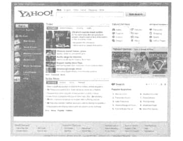
YAHOO is one of the most famous companies on the Internet. It has always ranked first in terms of access traffic, is the largest portal on the Internet, and is also a collection of vertical websites. YAHOO is committed to becoming the largest media on the Internet, covering the fields of network portal, e-commerce, network communication, etc. The services provided also include auction, shopping, opening online stores, chatting, etc. YAHOO is a global Internet communication, commerce and media company. It is the first website in the world to provide Internet navigation services, mainly supported by advertising. Advertising revenue accounts for 60% of the company's revenue. The website is shown in Figure 1-5 below.
 The style orientation of web design

YAHOO website takes light blue and purple as the main colors, and the new business column will change the corresponding theme from time to time, and customize different colors according to the corresponding theme, so that users will always have a fresh feeling. It will be introduced in detail below.

(1) Frame Structure I Home Page
The upper, left, middle and right, and lower structures are frames, or rather the left, middle and right structures. The main content of lazy websites is concentrated on the information content in the middle and right.

(2) Color
On the whole, YAHOO website uses two sets of adjacent colors, blue and purple, with gray as the auxiliary color to make the color transition harmonious. The logo "YAHOO!" of the website uses the highest purity color in the website. YAHOO website not only has a good grasp of the subtle test of color, but also has a good grasp of the purity of color.
(3) Text Color
Low purity plain blue and black are used. The plain blue text is used for the hyperlink form of the website. After the mouse pointer is put on it, there will be subtle changes in brightness and the appearance of underline. The explanatory text is in black.

(4) Graphics
The biggest picture on the home page is "YAHOO! Travel" on the right, which can directly reflect the new business of YAHOO website. The second is the news picture in the center of the screen, and the other is the navigation picture on the left (personalized service).
The eight icons on the left side of the website are the finishing touch to make the whole page lively, and also the special services customized for users. YAHOO website attaches great importance to the grasp of advertising details. Even the advertising color should be coordinated with the overall image of the website. The purity and color scale of the image are adjusted through image processing software to integrate, coordinate and adjust the website. The primary and secondary rhythm of the color reading of the entire image is well controlled.
From the above analysis, we can see that : The successful establishment of a website comes from the consideration and consideration of the details of each element of the website.
Source Statement: This article is original or edited by Shangpin China's editors. If it needs to be reproduced, please indicate that it is from Shangpin China. The above contents (including pictures and words) are from the Internet. If there is any infringement, please contact us in time (010-60259772).
TAG label:

What if your website can increase the number of conversions and improve customer satisfaction?

Make an appointment with a professional consultant to communicate!

* Shangpin professional consultant will contact you as soon as possible

Disclaimer

Thank you very much for visiting our website. Please read all the terms of this statement carefully before you use this website.

1. Part of the content of this site comes from the network, and the copyright of some articles and pictures involved belongs to the original author. The reprint of this site is for everyone to learn and exchange, and should not be used for any commercial activities.

2. This website does not assume any form of loss or injury caused by users to themselves and others due to the use of these resources.

3. For issues not covered in this statement, please refer to relevant national laws and regulations. In case of conflict between this statement and national laws and regulations, the national laws and regulations shall prevail.

4. If it infringes your legitimate rights and interests, please contact us in time, and we will delete the relevant content at the first time!

Contact: 010-60259772
E-mail: [email protected]

Communicate with professional consultants now!

  • National Service Hotline

    400-700-4979

  • Beijing Service Hotline

    010-60259772

Please be assured to fill in the information protection
Online consultation

Disclaimer

Thank you very much for visiting our website. Please read all the terms of this statement carefully before you use this website.

1. Part of the content of this site comes from the network, and the copyright of some articles and pictures involved belongs to the original author. The reprint of this site is for everyone to learn and exchange, and should not be used for any commercial activities.

2. This website does not assume any form of loss or injury caused by users to themselves and others due to the use of these resources.

3. For issues not covered in this statement, please refer to relevant national laws and regulations. In case of conflict between this statement and national laws and regulations, the national laws and regulations shall prevail.

4. If it infringes your legitimate rights and interests, please contact us in time, and we will delete the relevant content at the first time!

Contact: 010-60259772
E-mail: [email protected]