Differences between mobile web sites and APP
Source: Shangpin China |
Type: website encyclopedia |
Time: 2016-05-07
Microsite What is the difference between mobile Web sites and APP? The following is Shangpin China Website construction The company would like to share with you:
First of all, mobile phone stations and microsites are both products of the development of mobile Internet. In this way, businesses can have more opportunities to appear in people's lives 24 hours a day. Because of this feature, the development of mobile terminal websites has tasted the sweet cake. Micro websites, mobile phone stations and APP. The meanings of these three concepts are similar, which is easy to confuse. Distinguishing them has become a necessary knowledge point.
Let's talk about APP first 。 APP means application software. You need to download it on your phone to run it. This kind of application often appears in people's eyes, because when we use mobile phones to browse some websites, we sometimes get a prompt, please install the mobile client of this website, which is APP! From the perspective of development, it needs specific development languages, such as Objective-C for iOS platform, Java for Android, and so on. Therefore, the requirements for development companies may be relatively high. Another point is that as an application, people may not be willing to download you. Since it is a specific virtual object, it needs to be promoted for more people to see.
 Let's talk about mobile phone stations 。 Mobile phone station is called wap website. Generally, websites are viewed on the computer in the form of www website, while mobile sites are viewed in the form of wap. Usually, the content displayed on mobile stations is relatively simple, and the expression forms of pictures, animations, etc. are not clear enough. However, it has played a key role in the development of mobile websites. Although it is relatively simple, it is still of cross era significance.
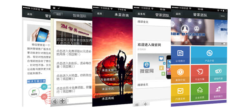
 Then there are micro websites 。 WeChat came into being on the platform of WeChat. Compared with the first two, its biggest difference is its wide spread. It simply needs to scan the QR code or follow the corporate public platform to browse a website with accurate page layout and text size on the mobile phone. It not only has the advantages of APP, but also has the meaning of surpassing the blue. Now many enterprise websites choose to establish microsites. And micro websites will also show their strength in more fields. The following figure shows the difference between the display of the same website on the PC side and on the mobile side. It can be seen that the interface design of the mobile terminal can be customized and better display the content of the PC terminal. Copy a sentence from other places: missed the Taobao era, missed the microblog era, and don't miss the WeChat marketing era, which is its unique charm.
 Now let's talk about the methods and guidelines for making mobile phone websites and apps:
The popularity of smart phones and tablets has generated more and more mobile client traffic. Although there are many types of mobile phone and tablet based web browsers and their functions are more and more perfect, due to the small terminal screen and network traffic, mobile devices are not suitable for directly browsing various websites based on desktop computers. Therefore, As a webmaster, it is necessary to add a portal suitable for mobile device browsing to your website.
There are many ways to build a website suitable for mobile browsing. The mainstream methods include adaptive web design, mobile website and mobile app application. Through these methods, an existing desktop website can be transformed into a website suitable for mobile device access in a short time.
1、 Adaptive web design
Adaptive web design is to enable the same web code to have a better browsing experience on different devices (from desktop computer monitors to smart phones or other mobile product devices). Therefore, before building a website, webmasters should consider how the page layout can adapt to multi screen browsing, so that mobile devices can browse desktop sites through the original website, What you see is the website automatically adapted to the screen size. Although the domain name is unified in this way, the code design is quite difficult for websites with complex structure and repeated pages. Therefore, adaptive web design is usually suitable for simple layout websites such as single column or double column websites, but difficult for complex layout websites.
Since the content of adaptive design uses the same web address, there will be no redirection. Therefore, it is unnecessary for visiting users to spend time memorizing other web addresses. For website developers, it is relatively simple to transform single column or double column websites into adaptive websites, and only minor modifications to CSS are required.
Adaptive web pages require mobile browsers to support css3. For example, the current iPhone and Android built-in browsers support css3, but the Nokia built-in browser does not support css3. Considering that older mobile phones have been phased out, these users can also consider ignoring css3. At the same time, adaptive web pages need to show more pictures, which consumes more traffic, so they are not suitable for 2G network users to visit.
For website modification, just add the viewport tag (control the display size, whether to allow zooming, initial scale, upper and lower limits, etc.), MobileOptimized tag (Microsoft defined width tag for IE Mobile) and HandheldFriendly tag (whether it is handheld friendly, only true or false) in the HTML header, Rules for different screen resolutions are added at the end of the CSS file. Relative width is used for layout width, and sidebar is hidden. Half an hour of development can improve the mobile browsing experience of the website. For more detailed website modification methods, please refer to the article "Adaptive Web Design Methods". I won't say more here.
2、 Mobile website
Mobile website refers to the re establishment of a mobile website according to the design rules of the mobile terminal for the existing desktop website. Although the content is the same as that of the desktop website, it has two different URLs. Usually, mobile websites are implemented by sub domain names, such as wap.ihucc.com or Such an address is specially customized for mobile users. Its content can be different from that of a desktop website. The website address of the desktop website will automatically redirect to the mobile website page after detecting the mobile device.
Mobile websites can support non touch smart phones and touch smart phones, which are suitable for websites that focus on mobile devices or specifically target mobile devices, and can be accessed using mobile browsers.
Baidu launched the "Lightboat Program" at the end of 2013, which aims to achieve the goal of 100% mobility of resources, so as to achieve the mobile transformation and upgrading of Baidu search. Mobile search will exclude PC pages that do not have unique value. For website owners, moving the website as soon as possible will be on the agenda.
Many blog and cms website building programs have a mobile page portal for the desktop. The website only needs to guide mobile device users to this portal. There are usually wap or HTML5 website building methods. The wap page is mainly aimed at old mobile browsers and 2G users, such as Nokia mobile users. The page is simple and saves traffic, but it is in the process of being eliminated. The following figure is the Moonlight Blog mobile website built by using the wap module of Z-blog.
HTML5 has a high technical threshold, and it will be difficult to develop independently. Many webmasters use mobile website building tools to generate mobile websites based on HTML5. At present, Baidu Site App is the most commonly used mobile website building tool. For the address of this tool, see here. Baidu Mobile Search will transcode most websites. The transcoded content is more suitable for small screen devices such as mobile phones. Baidu Site App can support webmasters to customize the pages of their websites after transcoding, It is also deployed to the website of its own independent sub domain name. At the same time, it supports the addition of special advertisements for mobile devices on the webpage through Baidu Alliance to obtain advertising revenue.
3、 Mobile APP application
Mobile APP apps refer to mobile APP apps that are released in Apple and Android app stores and can be used directly after installation. The development cost of mobile APP applications is high. Two sets of APIs are required for Apple and Android. However, mobile APP can allow users to use offline and access the hardware information of mobile devices, which is more suitable for applications with strong interactivity. For ordinary content websites, the benefits of using mobile APP applications are not obvious.
Due to the high threshold for mobile app development, webmasters can use relevant tools to automatically generate apps. Baidu Site App also has this function, which can generate iOS and Android app files with one click, but webmasters need to submit applications to Apple and Android app stores themselves.
Baidu Site App website
For website owners, these three forms can create websites suitable for mobile devices to visit. The development of adaptive web design is easy, mobile browsing experience is good, and adaptive AdSense advertising is also supported. However, Baidu Search is still unable to identify adaptive web pages, Some adaptive pages will be transcoded by Baidu Mobile Search (mainly because they do not carry the characteristics of mobile pages), making the original page design and AdSense ads unable to display. For websites expecting to obtain traffic from Baidu mobile search, they should give priority to independent mobile websites. Baidu has good support for mobile websites and will give priority to mobile websites in mobile search results. However, with the rapid popularity of smart phones, Baidu has gradually begun to support the display of adaptive web pages in mobile search. For Google, it does not transcode the web page, so it can have a good display effect for adaptive websites, but for unmodified pages, it will display desktop websites on mobile devices, which may consume more mobile traffic.
Therefore, for website owners, a more secure mobile solution is to provide both adaptive design of the website and a separate mobile website, so that users can get a good browsing experience and search engines can better include it.
Source Statement: This article is original or edited by Shangpin China's editors. If it needs to be reproduced, please indicate that it is from Shangpin China. The above contents (including pictures and words) are from the Internet. If there is any infringement, please contact us in time (010-60259772).
