"Design philosophy" is probably the most frequently used term in design review and college design education. It is called "Design Philosophy" in English. Here, "design philosophy" is often not our common sense of "philosophy", but the designer's personal concept of design, with a strong purpose. In fact, different designers have different design values, which forms different design philosophy. There is no single and unified design philosophy. Some designers can have their own "design philosophy", such as "least design for maximum satisfaction", or "less is more". In fact, these statements are not "philosophy", but more beliefs and maxims.
1、 Immersion and interactive experience
Whenever a new product is released, we will be attracted by its Landing page. Whether it's AirPods Pro or iPad Pro released some time ago, it's the same.
Behind this is an immersive and interactive product experience created by Apple based on webGL technology.
1. Continuity
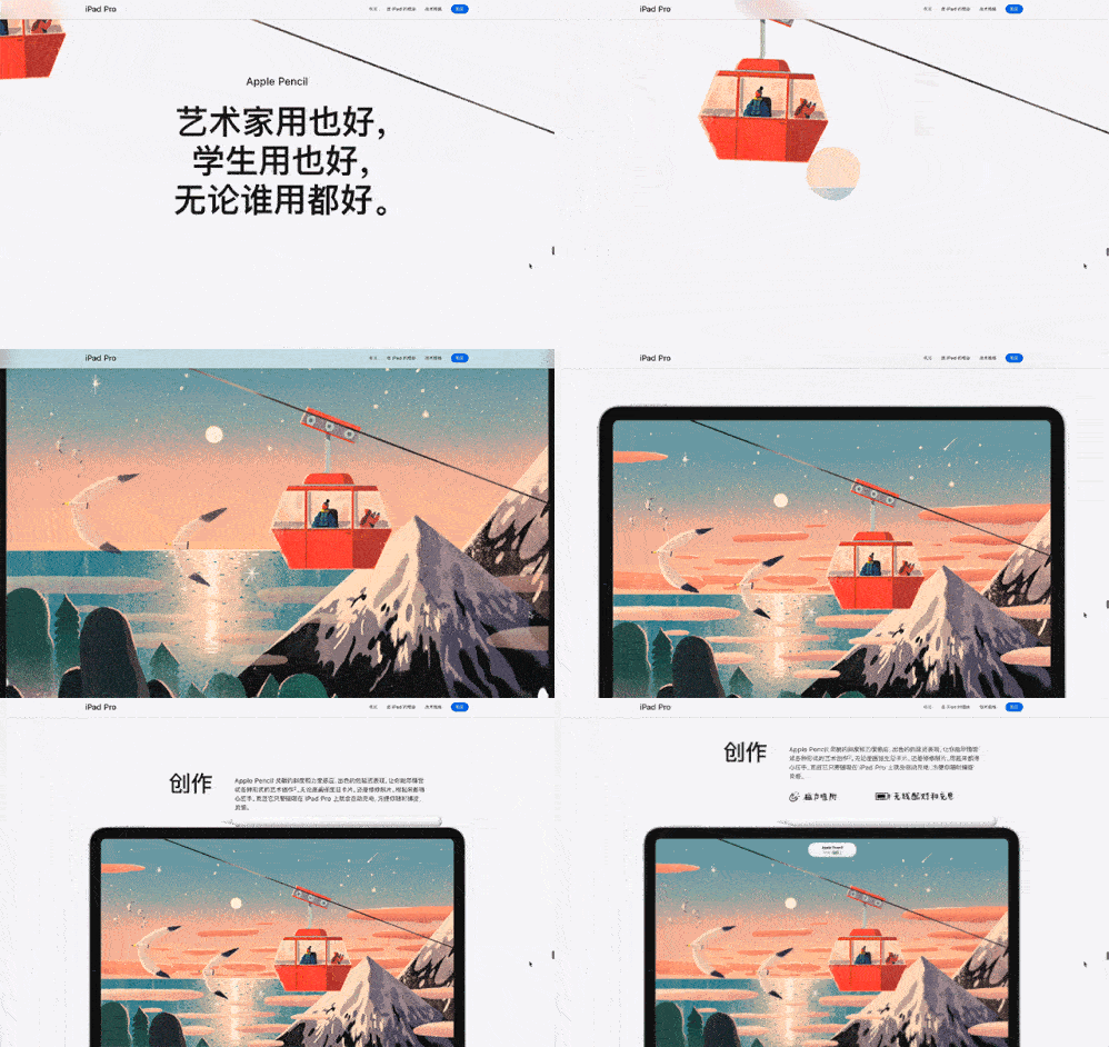
We can see from the product introduction page that Apple uses a large number of scrolls to reflect continuity.
On the one hand, scrolling is the most natural operation for most Web users, and its learning cost is extremely low.
On the other hand, under a lengthy page, scrolling can keep product features in a more natural transition.

Continuity of iPad Pro
2. Interestingness
In addition, a large number of Animated conversion (animated transition), that is, the dynamic effect displayed during operation, to increase interest.
Accompanied by rich, if hidden chapter text, just like the narration of the film, it is very clear.
It is wise to increase interactivity by rolling. Just imagine that if only the rendered demo video is placed, the user's operation will be limited, and they can only move forward or backward in the video, which is no fun.

Interestingness of AirPods
2、 Speak in order 1 Sense of order
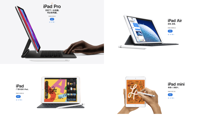
Speaking of order, let's take a look at the introduction of the iPad page. The four products are: iPad Pro, iPad Air, iPad and iPad mini.
The sense of order in the shooting angle is wonderful.


IPad's sense of order
The shooting angle of the iPad Pro is close to the front side.
The iPad Air is three quarter sided.
The iPad is front.
The iPad mini is a top view.
In this way, it will appear orderly and will not lead to visual fatigue.
2. Design language
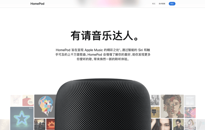
Secondly, the official website and iOS maintain a collaborative design language, presenting users with a consistent sensory experience.
Since iOS 11, Apple has adopted the font style of Large Title. The word weight has also shifted from the combination of Regular+Light to Medium+Bold to enhance the recognition in information dissemination.

HomePod
In addition, Gaussian fuzzy title bar background, product projection and other design languages also maintain the consistent style of the system. We can clearly see the synchronous transformation of Web design.
3、 Level 1 parallax
The third is the sense of hierarchy brought by parallax.
Apple pursues the Bauhaus concept of non decoration and minimalism. Of course, it is not the beauty of the vassal and the brilliance of the appearance, but it conveys complex and difficult technologies to users in a simple form.

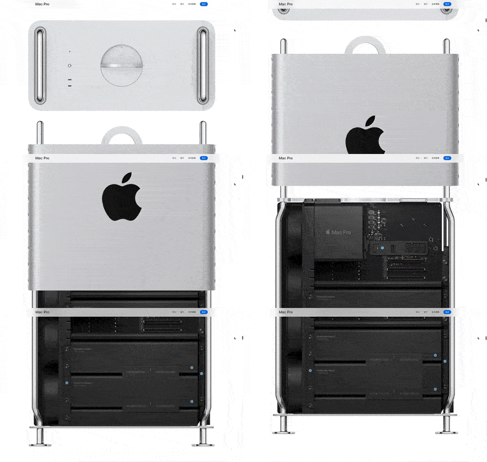
Mac Pro parallax scrolling
In terms of information level, Apple's layout design goes from simple to deep, just like peeling off the cocoon. Well used Parallax Scrolling To convey the concept of "layer" between pictures and words. This sense of depth can increase users' understanding and fun.
2. Visual tension
Moreover, the style is full of visual tension. The feeling of expansion, contraction, attraction, or rejection presents stimulation and shock. Take two examples:

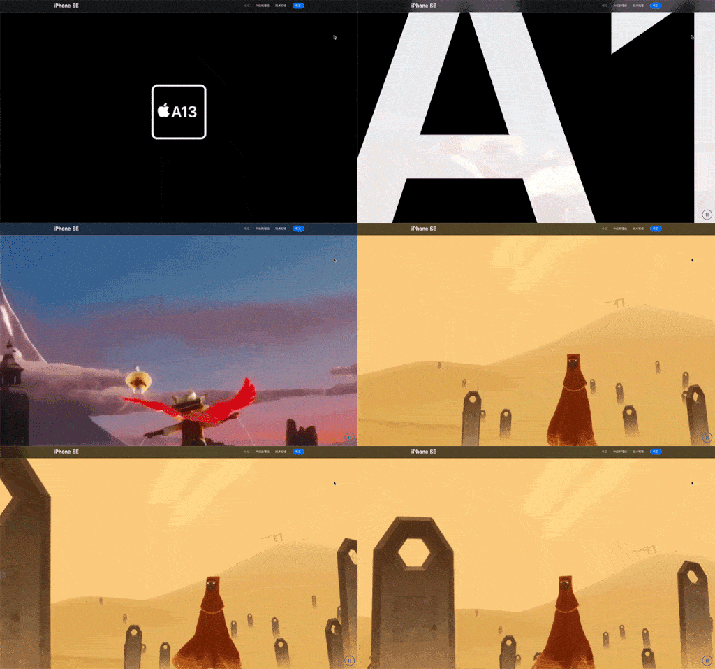
Expanding force of A13 chip
Expanding force: The whole picture takes A13 chip as the visual center, and the elements and layout expand outward around this visual center. With divergent visual guidance, visual tension appears, making people feel lofty and spectacular.

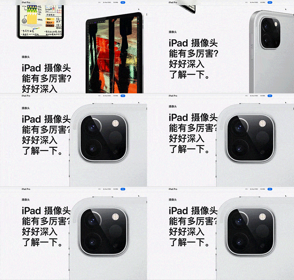
Repulsive force of Pro level camera
Repelling force: a certain intensity of visual repulsion can be formed by comparing the size of elements. Pro level camera is supplemented by big close-up to convey spatial awareness. Visually, it is touched by its composition and beauty.
4、 A sense of sophistication
Let's talk about how Apple's sense of sophistication comes from?
1. Visual noise reduction
We all know that high saturation color will affect people's mood fluctuations. On the contrary, the color matching with low saturation will have a sense of calm and restraint, because it is less stimulating to the human eye.

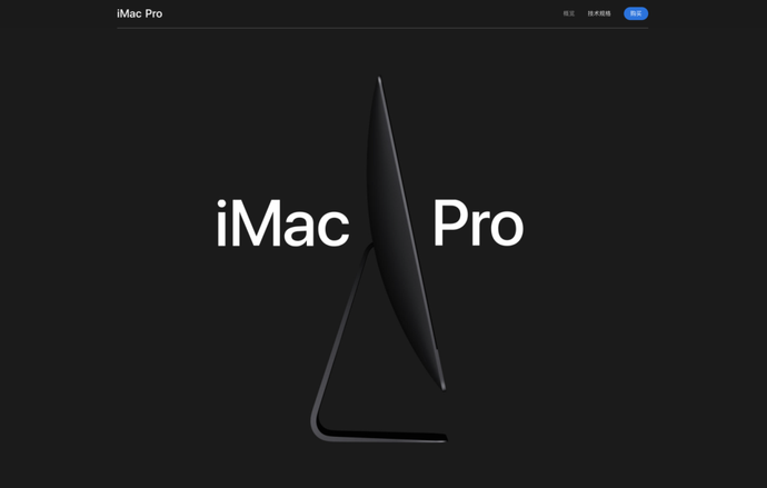
IMac Pro Advanced
Looking back at most of the pages on Apple's official website, in addition to the product interface color and button blue, the text, background and controls are all black, white and gray to create a sense of sophistication.
Even the new dark night green of iPhone 11 Pro is a little green added to the advanced gray.
In other words, reducing the number of colors used and the saturation of colors can reduce the emotion of colors to people and improve the sense of sophistication of products.

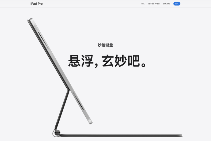
IPad left blank
In addition, proper blank space can highlight the product content more, so that important information can be conveyed more accurately. And it can create a broad sense of space, so that the picture can be extended, presenting a kind of artistic beauty.
Therefore, we should do more subtraction when designing, and avoid the accumulation of meaningless visual elements, which can make your design more advanced.
This also confirms the words of the modernist architect Mies van der Rohe: Less Is More 。
2. Drawing
Of course, leaving blank is not enough. Since it is for publicity, a high-resolution and exquisite picture is particularly important.
Most of the products on Apple's official website adopt live shooting+post editing, rather than rendering. The purpose is to reflect the texture of real products, as well as the light and shadow effect of materials, which can show Apple's ultimate pursuit of quality.

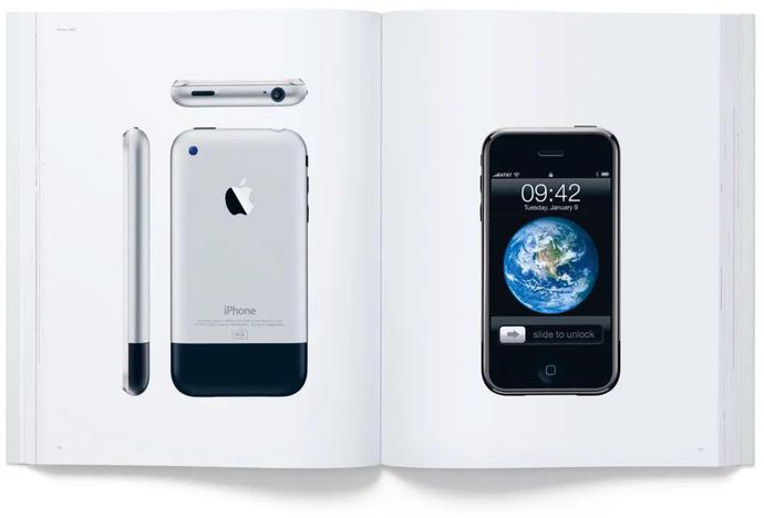
Designed by Apple in California
Not only that, the Apple product bible "Designed by Apple in California" and wallpaper were also shot by photographers. Interested students can see the following behind the scenes video, which is quite hard core.
3. Apple style copywriting
As all designers who have worked on the English Web know, English is often better than Chinese in design, and the same layout in English is also more beautiful.
This is not to worship foreign things. Psychology has a word called "shy mother tongue". To put it simply, Chinese is too common for us, which will make people feel cheap (actually shy).
Foreigners are the same. You can see that American enterprises: Apple, McDonald's and Starbucks all use graphic logos, while Japanese enterprises do not use their mother tongue, but use English, such as SONY, TOYOTA and Canon.

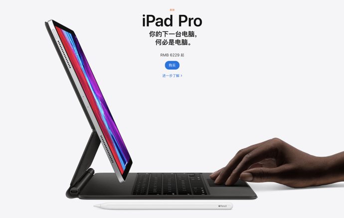
Your next computer, why is it a computer.
Back on Apple's official website, we can see that some of the texts are English product names, which won't make us feel shy.
What about the Chinese part? What's more interesting is that Apple's localization team used rhetorical devices such as completely incompatible but rhyming, strange parallelism, puns, and repetition. Although the language sense is very poor, I can basically understand the literal meaning.
In fact, the purpose of doing so is to create a Strangeness A unique language style to highlight the brand temperament. For example:
Repeat: For example, the iPad Pro "Your next computer, why is it a computer?"
Pun: For example, "It will always care about your heart" of Apple Watch
Parallelism: For example, the iMac's "From extreme speed to extreme speed, you can speed up."
Rhythm: For example, the accessory "can be recharged again and again."
Contrast: For example, the iPad mini's "small size, large energy."
4. Sense of ritual
One last point. Life should have a sense of ritual, and Apple's official website also has a sense of ritual.

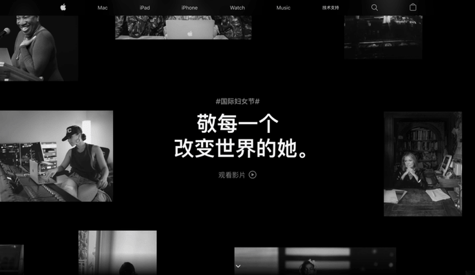
International Women's Day
On some special days, such as the March 8th Festival, friends choose to advertise. Apple launched the International Women's Day theme to pay tribute to the greatness of women, which is quite humanistic.
But then again, I was moved. It was still fragrant to participate in the discount activities of friends.
Special statement: This is Netease We Media Platform "NetEase ID" The author uploads and publishes it, which only represents the author's opinion. NetEase only provides information publishing platform.
