MENU service case
 Website construction website design Beijing website construction high-end website production company Shangpin China
We create by embracing change
360 ° brand value__
simplified Chinese character
Simplified Chinese English

Shangpin China Joins Hands with Beisheng Internet to Create a New Chapter in Website Construction

Type: Shangpin Dynamic Learn more

What are the layout segmentation methods in website design?
Source: Shangpin China | Type: website encyclopedia | Time: September 11, 2018
How can website designers make their websites quickly attract further attention from users after a quick glance? This article introduces a simple page layout method: split layout. This layout method tries to make users feel a friendly browsing experience when they first browse the page.
As a website designer, we can refer to many design examples and layout principles, such as grid, vertical consistency, F-type layout, Z-type layout, rule of thirds, golden section, etc. Paying attention to these principles will bring visual appeal and functionality to your design - now let's look at a simple way to divide the page in half.
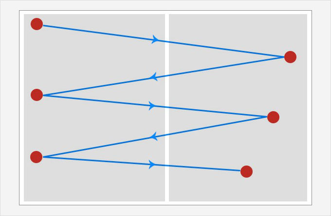
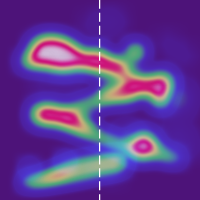
Although it sounds silly at the beginning, this basic layout can really play a very good role. When we scan a page, our eyes often move along a zigzag. If the user's eyes move along a horizontal line, just like in a Z-shaped layout, he/she will be very focused (or try to focus). But since 90% of the users of your website will not pay close attention to your page carefully when they first come here, making your design "browse friendly" will definitely get a good return!
Eye movement and zigzag
From Yahoo's eye tracking research, we can find that:
1. People scan the main part of the page to determine what the site is and whether they want to stay here longer.
2. If users decide to stay on the page, they will focus most on the content at the top of the screen.
3. The user will make a decision on the page in only three seconds
Users of the website are always in a hurry. They have other things to do. You can't expect them to stop to appreciate the aesthetics of your website. Although good aesthetic design is very important, it does not fully motivate visitors to take action - to click the "Buy Now" or "Learn More" button.
We can't blame these users. Always remember, when you want to query something? You will be eager to open the first search result of Google and quickly read it, or rather, roughly browse the whole page. Most of the time, you scroll to the bottom of the page without even noticing. After this stage, if you think this page is worth your time, you will return to the top of the page and really spend energy to read and pay attention.
So, what is the purpose of the user's initial browsing? When you first scan the page, you can capture as much information as possible. If we "develop" this browsing mode in some way, we should be able to get more attention from visitors. By observing the heat maps of a large number of websites, I have drawn a common trend.
Design is not just how it looks or feels, but how it works—— Steve Jobs "
For example, you can use the feature of half split layout to effectively arrange the preview of your work collection and the important features of your products or services, which will soon attract the attention of website visitors. Eventually, users will be encouraged to stay on your site longer and persuade them to take action. In this case, what will the result be? It will bring a higher conversion rate to your website and a better user experience to visitors.
It's easy to make your design and layout compatible with zigzags. In fact, it's as simple as splitting your page in half! The effect of bisection is good, because the endpoints of the zigzag can more or less align to the center of the bisection. Superimposed, they can echo each other well. Place important elements at the red end of the zigzag on your web page, which is the basic concept of split layout or 1/2 layout.
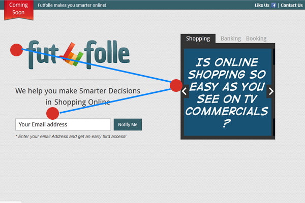
Recently, I devoted myself to designing an "upcoming" landing page. I tried a variety of layouts, but none of them satisfied me. I have tried almost every kind - such as rasterization, golden ratio, F-type layout, etc. But only when I bisect the page, there is a strong feeling of "I found it!" at that moment. The solution is so simple! It looks elegant and tidy, and reminds me of an important fact: simplicity is not necessarily a bad thing.
You can see how the bisection reflects a good visual level. First of all, the red ribbon of "Coming Soon" on the top is very eye-catching. Secondly, the logo is also very distinctive. Now, following the zigzag I mentioned earlier, visitors see the picture slider in the right half, and finally, arrive at the email submission form.
Now let's take a look at how the split layout can play a role in a web designer's portfolio page? The purpose of designing a portfolio page is to quickly show the main part of your work to potential customers. With the current industry so saturated, customers have many choices. Why should they pay you? Therefore, a great first impression will play a decisive role in your career direction. Let's see, what can we do?
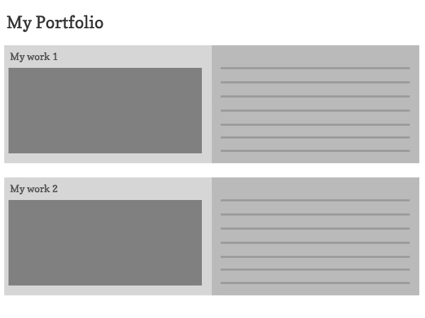
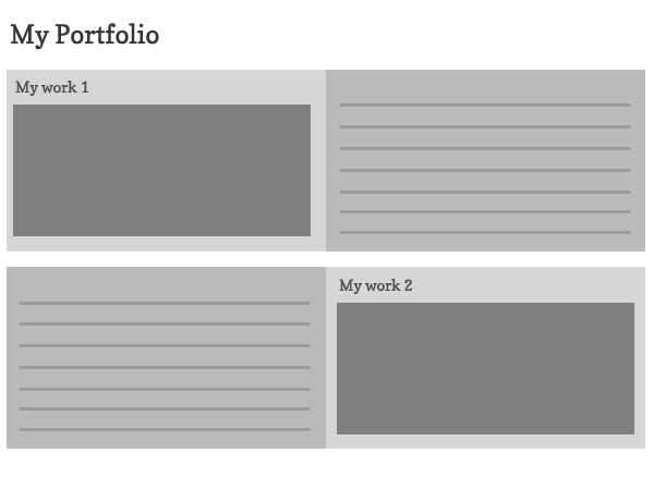
The layout in the above figure is divided into two halves, but it does not follow the zigzag principle I mentioned earlier.
Although it looks like a good layout and is easy to watch, it will be very dull and rigid after watching the first two elements. Breaking this visual flow and adding visual interest will change it. Not only that, when you try to browse the above layout, your eyes will first see the first picture, and then jump to the second piece of text. However, your visitors do not intend to read at this stage, so they will jump to other points, or leave your page completely!
But what if you made such a simple adjustment?

It's more interesting, isn't it? Simply exchange the positions of text and pictures in each project to increase visual vividness, so that this consistency will not make your users feel bored. At the same time, you can also place a call to action button behind the zigzag model.

This article comes from Shangpin China: Website design company

Source Statement: This article is original or edited by Shangpin China's editors. If it needs to be reproduced, please indicate that it is from Shangpin China. The above contents (including pictures and words) are from the Internet. If there is any infringement, please contact us in time (010-60259772).
TAG label:

What if your website can increase the number of conversions and improve customer satisfaction?

Make an appointment with a professional consultant to communicate!

* Shangpin professional consultant will contact you as soon as possible

Disclaimer

Thank you very much for visiting our website. Please read all the terms of this statement carefully before you use this website.

1. Part of the content of this site comes from the network, and the copyright of some articles and pictures involved belongs to the original author. The reprint of this site is for everyone to learn and exchange, and should not be used for any commercial activities.

2. This website does not assume any form of loss or injury caused by users to themselves and others due to the use of these resources.

3. For issues not covered in this statement, please refer to relevant national laws and regulations. In case of conflict between this statement and national laws and regulations, the national laws and regulations shall prevail.

4. If it infringes your legitimate rights and interests, please contact us in time, and we will delete the relevant content at the first time!

Contact: 010-60259772
E-mail: [email protected]

Communicate with professional consultants now!

  • National Service Hotline

    400-700-4979

  • Beijing Service Hotline

    010-60259772

Please be assured to fill in the information protection
Online consultation

Disclaimer

Thank you very much for visiting our website. Please read all the terms of this statement carefully before you use this website.

1. Part of the content of this site comes from the network, and the copyright of some articles and pictures involved belongs to the original author. The reprint of this site is for everyone to learn and exchange, and should not be used for any commercial activities.

2. This website does not assume any form of loss or injury caused by users to themselves and others due to the use of these resources.

3. For issues not covered in this statement, please refer to relevant national laws and regulations. In case of conflict between this statement and national laws and regulations, the national laws and regulations shall prevail.

4. If it infringes your legitimate rights and interests, please contact us in time, and we will delete the relevant content at the first time!

Contact: 010-60259772
E-mail: [email protected]