Improving website user experience: 6 suggestions to know
Source: Shangpin China |
Type: website encyclopedia |
Time: 2015-02-20
As a marketing website designer, our task is to talk with users. We choose colors, fonts, web layout to use, and even the way to write CSS, all of which have a clear purpose. However, sometimes the things we design can't express our original intention very well.
So whenever you design a website, remember to ask yourself: How can you bring about a better user experience?
1. Floating window advertising=money is more important than UX and content
Therefore, many websites choose floating window or mask advertising, which seems to be a modern form of pop-up advertising.
Like their "predecessors", pop-up ads and floating window ads are very annoying.
Floating window advertising is a very intrusive strategy, which greatly affects the user experience.
If your users have a hard time accessing the content on your website, you must have made some mistakes. The top priority of your design should be to show users its experience, and of course, it should also be explained Website construction company The content of is also very important.
By interrupting, delaying, or otherwise making users work hard to understand your content, you are telling them that the value of users is less than money.
Similarly, if users are forced to register, log in, and fill in email to access content, they should reconsider whether it is improper.
Imagine this situation: because your current host can't meet the existing needs, you are desperately looking for a new host. It just keeps crashing, which is to tell you that you have exceeded the current solution (PS: congratulations on the growth of your site by the way).
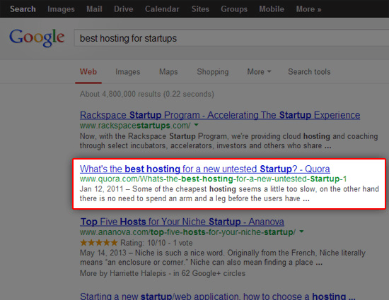
Like many technology entrepreneurs, your initial action to solve the problem is to use Google to search for a new host.
You happened to see a clue in Quora, a site that many entrepreneurs like you often visit.
You feel very excited now, because in a few seconds, you will have a good start! You ask yourself, "No, it shouldn't be so simple."
Then you click on this website, and it turns out that it is really not easy (even if it should be).
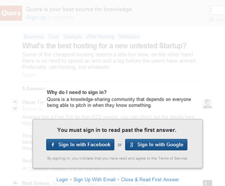
Sadly, you will find that this page requires you to connect to your Facebook account, otherwise you will not be able to see all the content.
If you choose not to log in with your Facebook or Google account, you can only see one answer. The rest of the answer is vague.
If this is the first time you visit the site, and the first thing they do to you is to cover up the content you want to see, will it leave you a terrible impression?
Let our users as convenient as possible to get the content they want to see should be the highest priority, as a web designer. Anything that hinders this goal should be removed from our design.
Now there are many ways to display advertising design strategies without too dazzling. For example, let users choose whether they want to interact with advertisements or at least one quick skip/ignore their choices, such as advertisements on the sidebar.
2. Lack of website accessibility=not everyone thinks you are important
Accessible website design needs to be more widely recognized by the design industry.
We need to pay attention to the innovation of our web design, which should be aimed at all users, not just the use of expensive touch screen smartphones.
Accessible web pages only span the disabled. Some users who use old mobile devices or have poor network speed (the global average network speed is only 2.9 Mbs, less than half of the average network speed in the United States) also need to be included.
Unless you want your website to be designed to leave the impression that you are targeted at specific users, you should carefully create a website with barrier free features. In fact, the characteristics of most barrier free web sites are relatively easy to implement, which is already a part of good network design best practices.
Although most of us will deliberately choose to ignore users who use a certain browser (such as deliberately choosing not to support Internet Explorer 6), this is extremely unfair, and perhaps they can't control it (such as color blindness).
3. Lack of appropriate white space=the readability of the content is not important
One thing, I saw a lot of websites that lacked some space around the content or pictures.
Blank is a powerful design tool. Blank space can make your content better displayed and easier to read. On the contrary, it will bring narrow feeling and visual discomfort.
Content is king, we should spend some (usually very little) time to ensure that the best form of release is achieved.
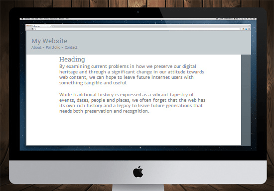
To illustrate how difficult it is to read the following passage:
This is difficult to read, because the minimum letter letter spacing, line height, padding, margin attribute values. These are easy to fix if you know CSS.
In a few seconds, only the values of some padding, margin, and line height attributes are adjusted, and the same text becomes easier to read.
Useful 404 error page=you care about users on the site
404 is often caused by incorrect URL input.
Some content linked to you may no longer exist or may have been moved.
Sometimes, due to technical problems, some web pages have just stopped working,.
For such an event, we need to create and design an effective 404 page, which is not just a page, but restates that users already know what happened (they did not visit the correct page).
Some basic techniques for designing effective error pages:
Prepare a search box for users to try to find a page;
Provide a contact method that can help users;
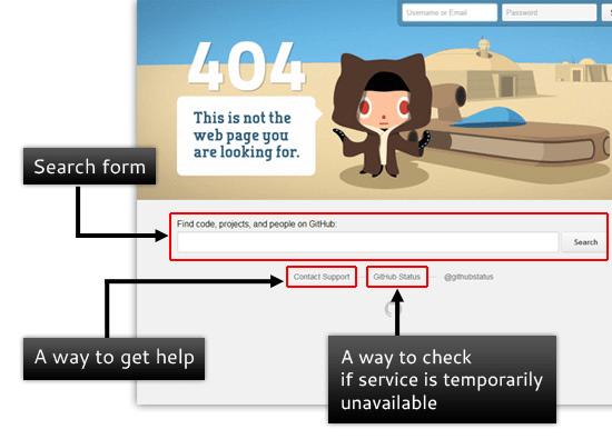
Automatically suggest a list of content related to the content they are looking for to link to other pages, listing your content (for example, archive pages, maps, help/support pages, etc.) The following is GitHub's 404 error page (a good case of 404 error pages):
What makes GitHub error pages effective?
It has a search form that users can use to find the correct page. It has a link that allows site visitors to get assistance. It has a link that allows users to see whether the site is only temporarily problematic
If you don't take measures to help users find the content they are looking for, then you just tell them that they should go to another website.
4. Weak background/foreground contrast=aesthetic design trumps clarity
Not providing enough color contrast between background and foreground is bad news for many users with poor vision. Then you are telling your users that you are more concerned with the aesthetic design of the website than its actual content.
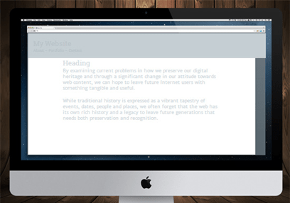
The following is an example of the effect of color lack of contrast on clarity
Only a few CSS adjustments are required. In this case, only the attribute values of h1 and p elements' colors are changed, which can greatly improve the user's reading experience.
If there are tools such as improving clarity, it will help your users care about these issues. Of course, this is also your responsibility as a web designer. You are committed to providing a better reading experience at the beginning of your work.
Focus as much as possible on achieving comfortable and pleasing content presentation. This will encourage users to pay attention to the content you provide.
5. No interactive function=do not care about users' opinions
Provide some methods for your users to contact you, which will make them feel that you care about their experience on the site.
This shows that you value their feedback, both positive and negative.
Some comment systems, contact forms, email, social networks, help and support forums, or a real-time chat tool, all of which indicate that you want to hear their feedback.
If the designer doesn't leave contact information or can interact with the readers, it means that you don't care what your readers have to say and care about their opinions.
However, user feedback is crucial for adjusting the website's UI and UX, so it is important to do a good job of interaction with users during website design.
So, do you have anything to say about this article? It's time to express your opinion!
Source Statement: This article is original or edited by Shangpin China's editors. If it needs to be reproduced, please indicate that it is from Shangpin China. The above contents (including pictures and words) are from the Internet. If there is any infringement, please contact us in time (010-60259772).
