MENU service case
 Website construction website design Beijing website construction high-end website production company Shangpin China
We create by embracing change
360 ° brand value__
simplified Chinese character
Simplified Chinese English

Shangpin China Joins Hands with Beisheng Internet to Create a New Chapter in Website Construction

Type: Shangpin Dynamic Learn more

Forms and principles of page layout in website design
Source: Shangpin China | Type: website encyclopedia | Time: June 22, 2014
Website Design Layout refers to arranging pictures and text in different positions of the page in the most suitable way for users to browse.

  1. Form of page layout

(1) "T" structure layout

The "T" structure layout is a widely used layout method in web design. Usually, the top of the page is the website logo, advertising bar, main menu, etc., with a column of sidebar on the right or left side, and then a wide body on the other side. This layout has a clear page structure and clear priorities, but it is easy to give people a sense of formality.

(2) "Mouth" layout

Usually, the top of the face is the website title and banner banner, followed by the main content of the website, with small pieces of content on the left and right, the middle part is the main part, and the bottom part is some basic information, contact information, copyright notice, etc. of the website. This layout makes full use of the layout. The information is large, but the page is often crowded and not flexible enough.

(3) "Sichuan" shape or "three" layout

The "Sichuan" layout page is vertically divided into several columns. Generally, it is divided into three or four columns, and the item part of the page is the sign bar or advertising bar. While the "three" layout page is horizontally divided into thousands of columns, and most of the color blocks contain advertising bars.

(4) POP layout

Most of the contents of the POP layout page are beautiful pictures and some small animations. Then place a simple link: or Liang uses Flash animation as the design center of the chastity surface. The layout is beautiful and attractive, but the browsing speed is slow. It is often used in fashion websites.

(5) Header Body Layout

The title body layout is usually the title or similar monetary content at the top of the page, and the body content at the bottom. This kind of access is often used in some policies or aspects of business websites, help article pages or registration pages.

(6) Frame layout

Frame layout includes left and right frame layout, upper frame layout and integrated frame layout. In left and right frame layout, navigation links are usually on the left. Sometimes there is a small title or logo on the top
The side is the body content. This layout has a clear structure, · L! Obviously, the page of Changchuan F Prison Forum and enterprise website.

The upper and lower frame layout is similar to the left and right frame layout, except that Ix is a two page LF frame. The layout of the comprehensive framework bar is a relatively complex framework structure, which usually combines the layout form of the left and right frameworks and the upper framework.

The specific type of layout structure shall be analyzed according to the actual situation. If there is a lot of content, you can choose the "T" or "mouth" layout form: if you need to show your corporate image or personal style, you can choose the POP layout form: if it is a specific content page, you can choose the title body layout form.

  2. Principles of page layout

(1) Highlight

The visual center of the page should be considered, that is, the center or upper middle position of the screen. Usually, the articles and pictures of - generation J can be arranged in this position. The minor contents can be arranged outside the visual center.

(2) Balance request

The audience's visual acceptability should be fully considered, and the page color blocks, colors, words, pictures and other information forms should be used harmoniously to achieve a stable, honest and reliable effect.

(3) Illustrated

Attention should be paid to the unity of words and pictures. Text and pictures set off each other, which can not only activate the page, but also enrich the page content.

(4) Concise and clear

The content of the web page shall be arranged for easy reading. Keep the layout simple by understanding the standard carpet and limiting the number of fonts and colors used.

3. Page color matching

In web page design, different colors should be combined and matched according to the principles of harmony, balance and emphasis to form a visually comfortable page. In web page design, the main content text is usually black, while the border, background Color should be applied to images. When designing web page colors, remember not to use all colors under the condition of "t." The techniques of web page color matching include: using the same color system colors: using contrast colors and complementary colors: making Sichuan transition colors: using natural colors and colors: the contrast between background and text should be as large as possible.

4. Page link form

The organizational structure of the web page mainly refers to the relationship between 9i sides, which can be in the form of divination:

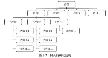
(1) Tree structure

The organization form of the tree structure page is shown in Figure 1-7. It is one of the main forms adopted by the current website. It is characterized by clear organization. Browsers can clearly understand their location according to the path, and it is not easy to get lost. At the same time, it also makes content expansion. However, the browsing efficiency of this structure is low.
 Tree structure
(2) Linear structure

The linear structure of web page organization is shown in Figure 1-8, which is generally used for small websites with less information, index sites, or to organize part of the content of a website.
 linear structure
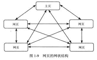
(3) Reticular structure

The web page organization form of network structure is shown in Figure 1-9. It is convenient for visitors to get information and reach their favorite pages at any time. However, due to too many links, it is easy to get lost.
 Reticular structure
Source Statement: This article is original or edited by Shangpin China's editors. If it needs to be reproduced, please indicate that it is from Shangpin China. The above contents (including pictures and words) are from the Internet. If there is any infringement, please contact us in time (010-60259772).
TAG label:

What if your website can increase the number of conversions and improve customer satisfaction?

Make an appointment with a professional consultant to communicate!

* Shangpin professional consultant will contact you as soon as possible

Disclaimer

Thank you very much for visiting our website. Please read all the terms of this statement carefully before you use this website.

1. Part of the content of this site comes from the network, and the copyright of some articles and pictures involved belongs to the original author. The reprint of this site is for everyone to learn and exchange, and should not be used for any commercial activities.

2. This website does not assume any form of loss or injury caused by users to themselves and others due to the use of these resources.

3. For issues not covered in this statement, please refer to relevant national laws and regulations. In case of conflict between this statement and national laws and regulations, the national laws and regulations shall prevail.

4. If it infringes your legitimate rights and interests, please contact us in time, and we will delete the relevant content at the first time!

Contact: 010-60259772
E-mail: [email protected]

Communicate with professional consultants now!

  • National Service Hotline

    400-700-4979

  • Beijing Service Hotline

    010-60259772

Please be assured to fill in the information protection
Online consultation

Disclaimer

Thank you very much for visiting our website. Please read all the terms of this statement carefully before you use this website.

1. Part of the content of this site comes from the network, and the copyright of some articles and pictures involved belongs to the original author. The reprint of this site is for everyone to learn and exchange, and should not be used for any commercial activities.

2. This website does not assume any form of loss or injury caused by users to themselves and others due to the use of these resources.

3. For issues not covered in this statement, please refer to relevant national laws and regulations. In case of conflict between this statement and national laws and regulations, the national laws and regulations shall prevail.

4. If it infringes your legitimate rights and interests, please contact us in time, and we will delete the relevant content at the first time!

Contact: 010-60259772
E-mail: [email protected]