Factors to be paid attention to in website design
Source: Shangpin China |
Type: website encyclopedia |
Time: April 21, 2015
Abstract: With the rapid development of the Internet today, the Internet has become an important channel for people to quickly obtain, release and transmit information, and is affecting human activities with an unprecedented impact. Website Design More and more close to an art rather than just a technology. The specific fonts, graphics, images, logos, etc. in web page design are often represented by such visual factors as dot, line, surface, color, movement, primary and secondary. The different use of these factors will affect the visual habits and psychological changes of readers. Multimedia and dynamic web pages are also coming into people's sight. What attracts users is the webpage with excellent visual effect, rich information and convenient use, so webpage design is particularly important.
1、 Page layout
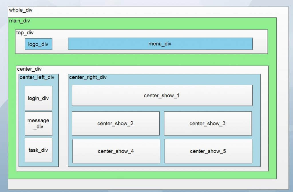
 In fact, it needs to be analyzed on a case by case basis: for example, if the content is very large, we should consider using "national font" or "corner"; If the content is not too much and there are many illustrative things, the title body type can be considered; A common feature of those frameworks is that they are easy to browse and fast, but their structure changes are not flexible; If a corporate website wants to show its corporate image or personal homepage wants to show its personal style, the cover is the first choice; Flash is more flexible. Good Flash greatly enriches web pages, but it cannot express too much text information. The picture page has different sizes and can be vertical or horizontal. Both pictures and text should be displayed to the audience at the same time. It is not allowed to simply list them on the same page, otherwise they will be disorderly. As for specific web page layout, the common types are "national" font, corner, title body, left and right frame, top and bottom frame, comprehensive frame, cover, Flash, and change. Detailed descriptions of them can be found in books related to web page design or on the Internet. Because only constant changes can improve and enrich our web pages.
2、 Web Design Skills
 A perfect homepage design needs to accumulate rich knowledge and master a lot of skills.
Use of Frames
The most common use of frameworks is navigation. A group of frames usually includes a frame with navigation bar and another frame to display the main content page.
Using frames has the following advantages: visitors' browsers do not need to reload navigation related graphics for each page; Each frame has its own scroll bar (if the content is too large, it cannot be displayed in the window), so visitors can scroll these frames independently. For example, when the content page in the frame is long, if the navigation bar is located in different frames, visitors who scroll down to the bottom of the page do not need to scroll back to the top to use the navigation bar.
The use of frames has the following disadvantages: it may be difficult to achieve accurate graphic alignment of elements in different frames; Testing the navigation can be time consuming.
3、 Principles of web page art design
As a carrier of information dissemination, web pages have much in common with other publications, such as newspapers and magazines, and should also follow some basic design principles. However, due to the different forms of expression, modes of operation and social functions, web design has its own special laws. The art design of web pages is the combination of technology and art, and the unity of content and form.
Elements of web design:
In a website, the most important page is the home page, so take the home page as an example to illustrate the layout design in web page production. In terms of layout design, a distinctive homepage must contain four elements: text, pictures, arrangement and main color, which complement each other and are indispensable.
1. Picture elements
To design a beautiful home page, you must first become a computer graphics expert. This alone can allow beginners to spend a year and a half. The image requirements are related to the content of the page. For some casual home pages such as stocks and medical sites, visitors don't care whether you can make wonderful pictures. Sometimes they think that the placement of images affects the access speed, and they only care about the content of the page; On the contrary, like some home pages that need images to attract visitors, images are an extremely important element. Without proper images, the entire page will be eclipsed and become an incomplete home page. This requires learning graphics and image processing software such as Photoshop, as well as a certain art foundation, such as aesthetic appreciation and creative skills.
2. Color elements
Color accounts for a large proportion in web pages. With reasonable and fresh colors, it will make up for other shortcomings on the home page. The color matching of the page is inseparable from the theme of the website. A website must have one or two theme colors. It will not let visitors lose their direction and become tedious. Generally speaking, the main text of the page should be dark colors such as black, which should be clearly contrasted with the background, and the buttons and borders should be colored. The color of the home page is handled well, which can make things better and achieve the effect of twice the result with half the effort. The general application principle of color should be "overall coordination and local contrast", that is, the overall color effect of the home page should be harmonious, and only local and small areas can have some strong color contrast. In the use of color, different main colors can be used according to the needs of the home page content. Because the color is symbolic, for example, tender green, emerald green, golden yellow and grayish brown can respectively symbolize spring, summer, autumn and winter. Secondly, there are occupational logo colors, such as olive green for military police, white for medical care, etc. Color also has obvious psychological feelings, such as the feeling of cold and warm, and the effect of advancing and retreating. In addition, color also has nationality. Due to the influence of environment, culture, tradition and other factors, there are also great differences in the preferences of different nationalities for color. Making full use of these characteristics of color can make our home page have profound artistic connotation, thus improving the cultural taste of the home page.
3. Text elements
The combination of text, title, picture, etc. will form various lines and shapes on the page. The combination of these lines and shapes forms the overall artistic effect of the home page. It is necessary to match these lines and shapes artistically to enhance the artistic charm of the page.
4. Layout
The design of the homepage first involves the layout of the page. "Layout" is actually the "business position" in ancient Chinese painting theory. As a kind of layout, the homepage has both text and pictures. There are large and small characters, as well as titles and text; The picture also has size, and there are horizontal and vertical differences. Pictures and words need to be displayed to the audience at the same time, and they cannot be simply listed on the same page, which often leads to chaos. Therefore, these pictures and words must be reasonably arranged and arranged in a certain order according to the needs of the content, so that they can form an organic whole and be presented to the broad audience.
Points in modeling elements of web design
The point in commercial web page design is the most basic unit of web pages, which refers to the visual characteristics of the point in the page and the smaller object image. A single point is relative to the overall background; It has size, shape and volume. Different size, shape and position of points will produce different visual effects and psychological effects. A web page often needs to be composed of a number of points with different shapes, which can be specific products, product logos, etc., or sensory points.
The point can not only play a role of stable modeling in design, but also play a role of lively and vivid, attracting the visual center. When used properly, it can even make the finishing point; The shape, direction, size, location, aggregation and divergence of points can also bring different psychological feelings to people.
Dynamic webpage
Dynamic web page is the most commonly used expression form of website construction. Its advantage is that it can return corresponding data according to different requests of users according to the previously developed program interface. It can be said that it is a one to many relationship. So as to achieve the maximum utilization of resources and save physical resources on the server. If you need to change the site style in the future, you just need to re create the data accessed by the foreground. As long as the database structure remains unchanged, it can be revised quickly. Generate the web page of client web page code by executing asp, php, jsp,. net and other programs. Dynamic pages can usually be updated and managed through the website background management system. Publishing news, publishing company products, communication and interaction, blogs, online surveys, etc. are some of the functions of dynamic websites, which are also common to us. Dynamic web pages need language environment support. The common extensions of dynamic pages are:. asp,. php,. jsp,. cgi, etc. The "dynamic" of a dynamic page means that the website interacts with the client user, rather than a dynamic page if there is animation on the page.
Multi-Media
The difference between web pages and traditional media lies in the dynamic updating and real-time interaction of information. Real time interactivity is the main reason why the Web has become a hot spot, and it is also a problem that must be considered when designing web pages. Traditional media (such as radio, TV programs, newspapers and magazines, etc.) provide information in a linear way, that is, they are spread according to the feeling, experience and predetermined format of the information provider. In the Web environment, people are no longer passive receivers of traditional media, but participate in the processing and publishing of information as active participants. This kind of continuous interaction makes web art design different from print design. After publishing, it means the end of design. Web designers must regularly adjust and modify the web pages according to the business objectives of the website at various stages, in coordination with the business strategies of the website at different periods, and the feedback information from users. For example, in order to maintain the freshness of visitors to the website, many large websites are always revised regularly or irregularly, which requires designers to constantly create new web design works on the basis of maintaining the consistency of the website's visual image.
At present, the multimedia audio-visual elements used in web pages mainly include words, images, sounds, videos, etc. With the increase of network bandwidth, the improvement of chip processing speed, and the promotion of cross platform multimedia file formats, designers will certainly be prompted to use multiple media elements to design web pages, in order to meet and enrich the higher requirements of viewers for the quality of network information transmission. At present, the domestic web pages have appeared a simulated three-dimensional operation interface. With the improvement and promotion of data compression technology, real-time audio and video services have appeared on the Internet, such as online music, online broadcast, online movie, online live broadcast, etc. Therefore, the comprehensive use of multiple media is one of the characteristics of web page art design and the future development direction.
Through learning website design, I learned that the layout framework of web design and the different use of different factors in web design will affect the visual habits and psychological changes of readers. To attract others, we should first seize the characteristics of different elements and make use of them. We should also know how to express different characteristics and feelings, and combine the various elements to constantly increase the rich, smooth and lively atmosphere, inject new blood into the web culture, and constantly try to improve. Only constant changes can improve.
Source Statement: This article is original or edited by Shangpin China's editors. If it needs to be reproduced, please indicate that it is from Shangpin China. The above contents (including pictures and words) are from the Internet. If there is any infringement, please contact us in time (010-60259772).
