-
simplified Chinese character -
Simplified Chinese English
Shangpin China Joins Hands with Beisheng Internet to Create a New Chapter in Website Construction
Specification of website design page


-
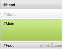
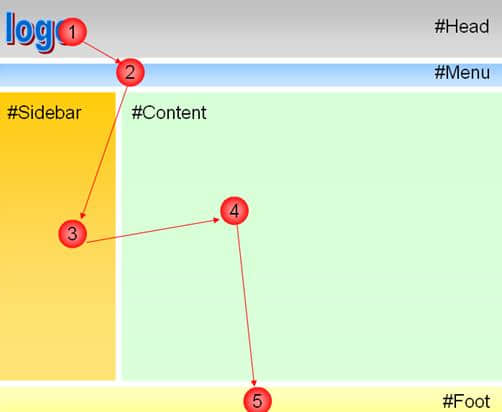
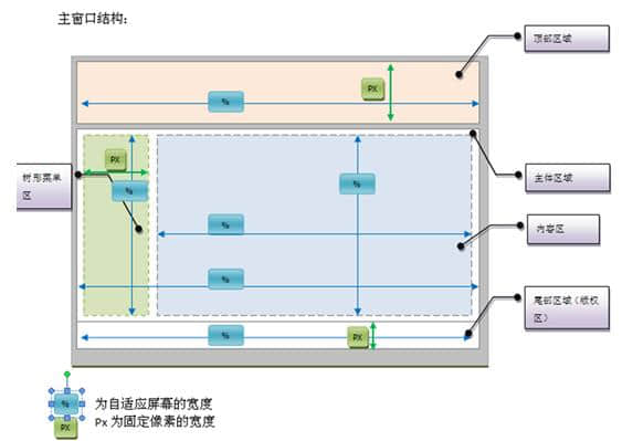
The width of the Head area is set in a proportional manner, the width is set at 100%, and the height is determined by the fixed pixel value occupied. Generally, the width is set at 100%? Px. If there is a menu area, adjust it to "menu"? px; -
The configuration requirements of the Menu area are the same as that of the "head". The width is set at 100%, and the height is determined by combining the height setting of the "head". Generally, the width is set at 100%? px; -
The width of the sidebar area is determined according to the golden segmentation ratio between the sidebar area and the "content" area. The width is determined by the way of fixed pixels, generally accounting for? px; The height is set proportionally; -
In the Content area, the layout of the height and width direction is set in proportion; -
In the Foot area, the width is set at 100%, and the height is determined by the fixed pixel value occupied. Generally, the width is set at 100%? px;
-
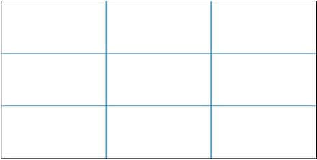
The length width ratio is close to the golden point ratio, and the length width ratio must not be misadjusted, or the width exceeds the length; -
The layout should be reasonable. It should not be too dense, nor too open, and the space should be used reasonably; -
The size of buttons on the same page should be the same, and the size of buttons on different pages should be as similar as possible, and too long names should not be used on buttons; -
The size of the button should be consistent with the size and space of the interface; -
Avoid placing large buttons on the open interface; -
After placing the control, there should be no large vacancy in the interface; -
The font size should be consistent with the size ratio of the interface, and the commonly used font is 12px; -
The foreground and background colors should be matched reasonably and harmoniously. The contrast should not be too large. The main color should be soft. It is better to use less dark colors, such as bright red and green. You can borrow the color of Windows interface; -
The main colors commonly used by large systems are "# E1E1E1", "# EFEFEF", "# C0C0C0", etc; -
The interface style should be consistent, and the size, color and font of the characters should be the same. It is recommended to use pictures where artistic treatment or special requirements are required; -
If the form supports maximization or enlargement, the controls on the form should also be scaled with the form; Do not only enlarge the form but ignore the zoom of the control; -
The system dialog box page should not support zooming, that is, the upper right corner only has the closing function; -
Generally, when the parent form supports zooming, the child form does not need to be zoomed; -
If the user can be provided with a custom interface style, the user can choose the color, font, etc;
-
Header text in "Head", 20px; -
Navigation text in "Menu", 14px; -
Text in "Sidebar", 12px; -
Body in "Content", 12px or 14px, title; -
Text in "foot", 12px or 10px;
Station building process
-
Website requirements -
Website planning scheme -
Page design style -
Confirm delivery for use -
Data entry optimization -
Program design and development -
Follow up service -
contact number 010-60259772
Hot tags
-
Website construction -
Food website construction -
WeChat applet development -
Applet development -
Wuxi website construction -
Website construction of research institute -
Shenyang website construction -
Langfang website construction -
Zhengzhou website construction -
Construction of wedding photography website -
Mobile terminal website construction -
University website production -
Tianjin website construction -
Education website construction -
Brand website construction -
Government website construction -
Beijing website construction -
Website Design -
Website production
Latest articles
-

Website construction scheme: Fresh makeup aesthetics website Type: website construction 2025-03-13 -

Enterprise website construction plan: create a new business card for the network and open the digital future Type: website construction 2025-03-11 -

High end website production solution Type: website construction 2025-02-18
Recommended News
-
Some Thoughts on Difficulties in Upgrading the Ranking of Medical Websites and How to Deal with Them It may not be completely correct. The above are some of the difficulties in improving the ranking of medical websites and how to deal with them 2013-06-15 -
Problems that should be paid attention to in the implementation of network plan When applying the network planning method, its steps are divided into two stages: planning and scheduling. The former is to draw a network diagram 2015-10-31 -
The specific process of Shangpin website production and SEO optimization Many friends who have just learned about website construction do not know much about the specific process and steps of website production 2013-07-19 -
Explore the new mode of recent enterprise website construction With the diversification of user devices, an excellent enterprise website should support various types of devices, including 2024-05-29 -
Intelligent website design The problem is that most commercial website designs are boring, lifeless and not attractive enough. Why? ... 2013-07-21 -
Analysis of the Bubble Value of Internet Companies Since human life has been inseparable from the Internet, new things related to the Internet have emerged, such as 2015-11-07
Make an appointment with a professional consultant to communicate!
Disclaimer


