What is H5 page design?
Source: Shangpin China |
Type: website encyclopedia |
Time: August 2, 2017
What does H5 page design mean? The following is Shangpin China Website production The company would like to share with you:
H5 refers to the 5th generation HTML, the so-called HTML5, and all digital products made in H5 language. HTML is the abbreviation of "Hypertext Markup Language". Most of the web pages we see online are written in HTML. "Hypertext" means that the page can contain pictures, links, even music, programs and other non text elements. "Mark" means that these hypertext must be marked by the beginning and end marks containing attributes. By decoding HTML, browsers can display web content, which also forms the basis of the rise of the Internet.
The first version of HTML was developed in 1991 and released in 1993. The HTML should be updated once in a while, but it has not been updated since the release of HTML4.01 in December 1999. In the following ten years, the Internet industry has undergone tremendous changes, and people gradually realize that the original HTML can no longer adapt to the development of the Internet. At this time, two organizations proposed new solutions: WHATWG and W3C. The former developed Web Applications 1.0, while the latter developed XHTML 2.0. In 2006, the two sides decided to cooperate to create a new generation of HTML, which is H5.
Since the release of the draft in 2008, H5 has not attracted wide attention, but has entered a long-term iterative optimization cycle. Until last October, the W3C finally announced that after eight years of efforts, the HTML5 standard specification was finally formulated and opened to the world. The opening of H5 standards and specifications is destined to become an epoch-making event, and H5 tools are also gradually showing their brilliance. For example, H5 production tool interaction masters who can make visual production without writing code have attracted the attention of all parties. The reason why H5 can cause such a wide range of effects is that it is no longer just a markup language. It provides a new framework and platform for the next generation of Internet. For example, H5 tool interaction masters provide plug-in free audio and video, image animation, local storage and more cool and important functions, and make these applications standardized and open, So that the Internet can also easily realize the application experience similar to the desktop.
The most obvious advantage of H5 lies in its cross platform nature: for example, sites and applications built by interaction masters can be compatible with PC and mobile terminals, Windows and Linux, Android and IOS. It can be easily transplanted to various open platforms and application platforms to break the situation of self governance. This strong compatibility can significantly reduce development and operation costs, and allow enterprises, especially entrepreneurs, to gain more development opportunities.
In addition, the local storage feature of H5 also brings more convenience to users; The light applications developed based on H5 have shorter startup time, faster networking speed, and no need to download and occupy storage space, which is particularly suitable for mobile media such as mobile phones. The interaction master allows developers to create advanced graphics, layout, animation and transition effects without relying on third-party browser plug-ins, which also allows users to enjoy cool visual and auditory effects with less traffic.
After introducing what HTML5 is, let's enjoy the design case of HTML5:
1. Activity operation type
The H5 page created for the promotion and operation of the event is the most common type, with various forms, including games, invitations, greeting cards, test questions, etc. Different from the simple static advertising image dissemination in the past, the H5 campaign operation page today needs a more interactive, high-quality, and topical design to facilitate user sharing and dissemination. From entering WeChat H5 page to finally landing in the brand app, how to design a suitable drainage route is also very important.
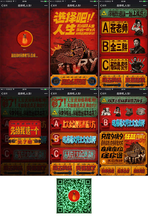
The promotion page designed by the public review for the film Fury is well aware of this. The visual design of the retro imitative style makes people stand out. The old ticket root with rich texture, flashing neon lights, together with humorous animation and sound effects, can't wait to order every option. Focusing on the brand keyword "choice", the user is asked to choose life as a blockbuster with fascinating test questions. The last question leads to "public comments and movie watching", and the one click access to the App ticket page. Even though he knew it was soft text, he couldn't help clicking to share with the mood of "low oil is good, this page is a little diao".
 2. Brand promotion
Unlike the time sensitive activity operation page, the brand publicity type H5 page is equivalent to a brand's micro official website, which is more inclined to brand image building and convey the brand's spirit and attitude to users. The design needs to use visual language that conforms to the brand temperament to make users deeply impressed with the brand.
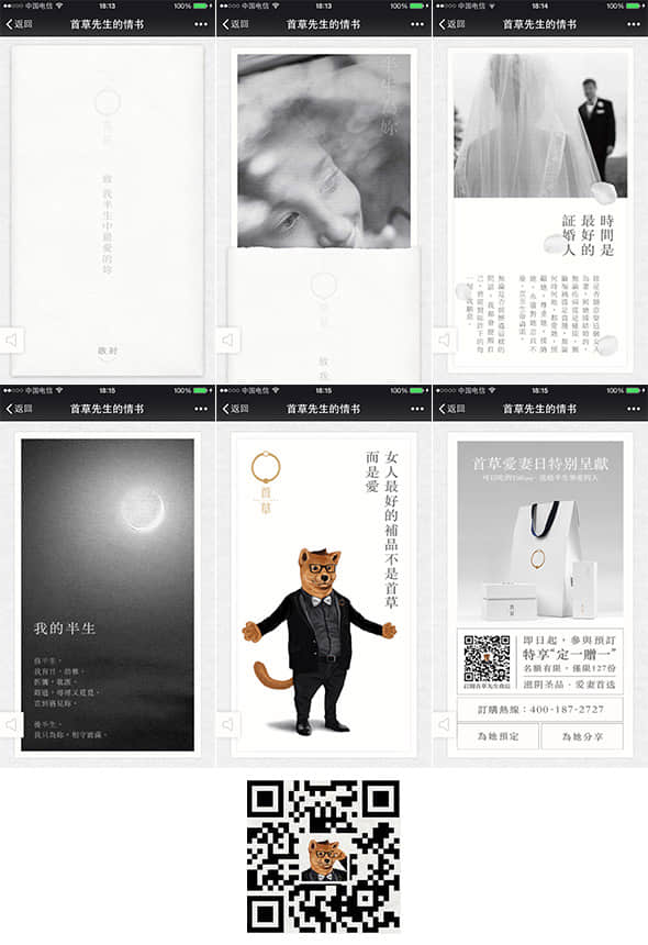
Along with the romantic piano melody, Mr. Shoucao's Love Letter tells the story of love and guilt for his wife in the growth process in a man's voice, and finally leads to the slogan of "the first draft - the holy product for nourishing yin, the first choice for a wife". The design adopts reminiscent black and white colors, simple photos and words, together with light animations such as petals falling, water ripples, etc., to render a beautiful and elegant atmosphere. "Shoucao", a brand new high-end health care herbal medicine brand, uses H5 to show a wandering emotion, which reminds users of the brand image of "half your life is for you".
 3. Product introduction
Focus on the introduction of product functions, and use H5's interactive technology advantages to display product features to attract users to buy.
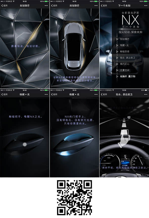
This type of H5 page is mostly seen in automobile brands, and LEXUS NX is an excellent representative case. Delicate and highly textured modeling and delicate lighting effect create a cool visual style. Use your fingers to follow the path of light to cut the screen. Through reasonable and elegant touch, friction, sliding and other interactive forms, you will lead users to explore the seven characteristics of the product, taking care of both macro and micro aspects.
 4. Summary report type
Since the 10-year bill of Alipay caused a heated debate, the year-end summary of major enterprises has also been enthusiastic about using H5 technology. The excellent interactive experience has made the boring summary report interesting and vivid.
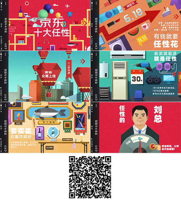
The Top Ten Caprices of Jingdong tells the top ten achievements of Jingdong in 2014 with 10 horizontal screen pages. The visual design adopts simple flat style illustration and adds paper texture to form a retro card collage. The smooth parallax scrolling effect is achieved by sliding fingers between different pages, and finally there is the little egg of President Liu. After reading it at one time, we will probably know what great things JD did in 2014.
 2、 In the form of functional service
After determining the functional objectives of the topic page, the next step is the key design phase. How to design purposefully needs to consider the specific application scenarios and propagation objects, and consider what kind of pages users want to see most and will share most from the perspective of users. Here are some common expressions of H5 topic pages:
1. Simple image and text
Simple pictures and texts are the most typical form of H5 topic pages in the early days. The form of "picture" is ever-changing, which can be photos, illustrations, GIFs, etc. Through simple interactive operations such as turning pages, the effect of transmission is similar to that of slides. The test is the quality of the content itself and the ability to tell stories.
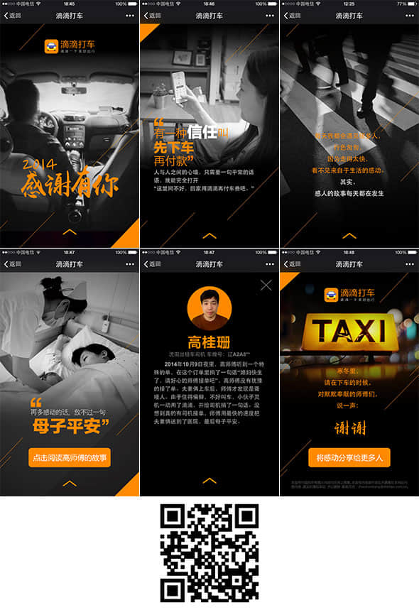
The case of Didi Taxi is a typical simple graphic H5 topic page, which is linked by several photos and stories. The vision is simple and powerful, and the whole screen black and white photos are used, embellished with drops of brand orange. Every time a picture is switched, the words will appear gradually, without other forms of interaction, so that the audience can focus on the content and shape the brand's positive energy image through the true relationship between strangers.
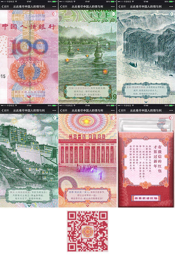
 There are also wonderful cases that are not indifferent. On New Year's Eve, when people across the country were scrambling for red envelopes, WeChat launched a special page titled "See All the Chinese People's Names and Benefits from Now on". At the first sight, it was suppressed. Every page of the friendly RMB is a partial magnified picture of the RMB landscape. The creators add ingenious creative elements and micro dynamics to delicately depict it, taking the audience into the micro world of RMB. The patterns of each banknote, together with thought-provoking copywriting, appeal to people to re-examine the meaning of human feelings and fame and wealth while promoting WeChat red envelopes.
 2. Gifts/cards/invitations
Everyone likes the feeling of receiving a gift. Grasping this mentality, the brand launched various H5 forms of gifts, greeting cards, invitations, and achieved the purpose of brand promotion imperceptibly by improving user goodwill. Since it is a gift, creativity and production are important bonus items.
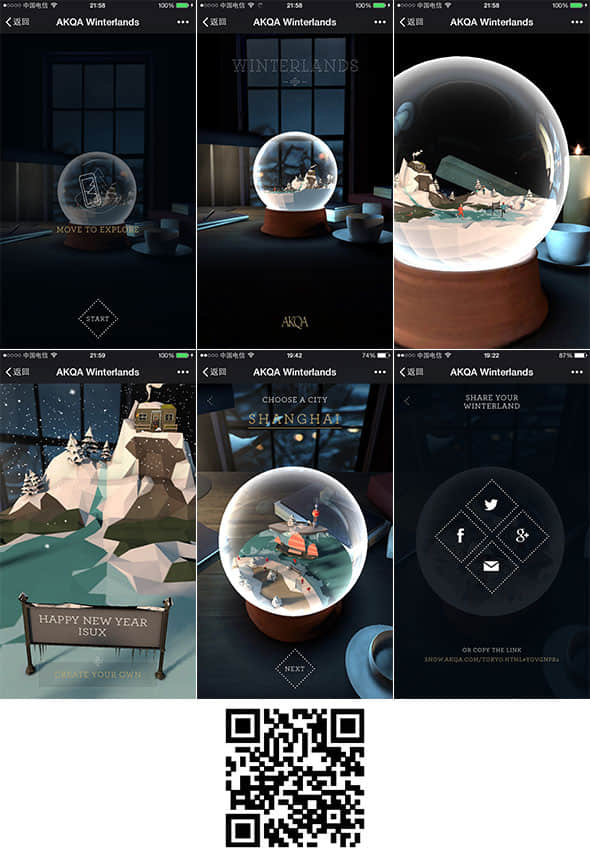
AKQA creative marketing company presented a generous gift - Dream Crystal Ball at Christmas. Through mobile phones, the lens constantly shakes and pushes closer from the outside of the crystal ball, and gradually enters the micro world of the crystal ball. Looking around through your mobile phone, you can enjoy the panoramic view of the crystal ball 360 degrees, and shake the snow and it will float all over the sky. Write down your blessings and share them with your friends. I believe they will be amazed. This H5 page uses gravity sensing, 3D and other technologies, and the use of text and BGM is also very particular, which brings users a perfect interactive experience and is worth savoring.
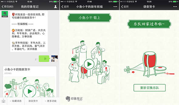
 Evernote also launched a unique voice greeting card during the Spring Festival, guiding users to send a voice message to them through the public account, and then combined this blessing voice with Chinese style animation to make a unique voice greeting card to send to friends. The overall tone is also based on Evernote brand color, and it also contains a hint of elegant flavor, which is very pleasing.
 3. Q&A/Scoring/Testing
The H5 page in the form of question and answer is also common, and users' thirst for knowledge and exploration are used to choose all the way to see what the final results are. A clear clue is necessary, and the final result page should also be reasonable and unobtrusive. It would be great if it could be supplemented with brilliant vision and copy to weaken the boring feeling of the answer.
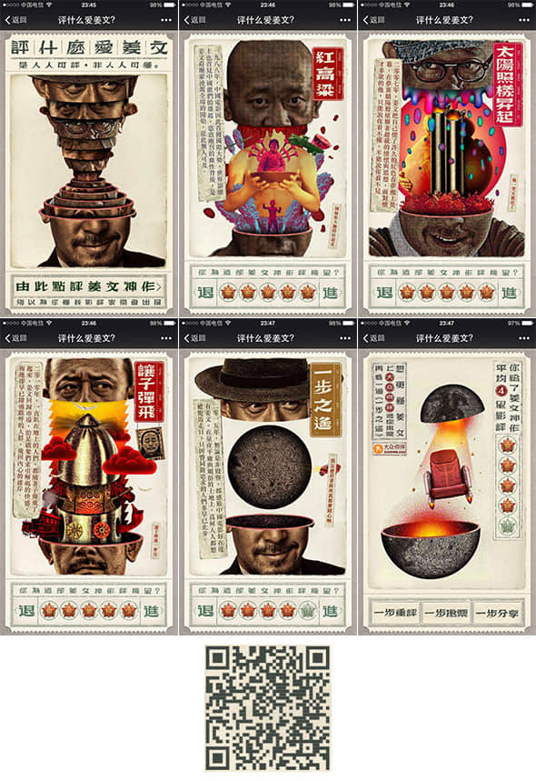
As at the beginning of this article, it is also a public comment project. This time, it is a continuous promotion of Jiang Wen's film "A Step Away", allowing users to score Jiang Wen's representative works. The visual design is still brilliant, and the creativity and animation design of mind opening are amazing (you must scan and experience!). It continues the style of nostalgic big character newspaper, and details such as font, copywriting and decorative elements are also carefully handled. The question and answer form of H5 page can do this, which is also pretty spelled.
 4. Games
From simple games such as "Encircle the Nervous Cat" and "See You Are Colorful" to brand implantable games such as Durex "One Night Njilang" (that is, the copycat version of "Don't Step on White Blocks"), H5 games were once popular among friends because of their simple operation and strong competitiveness, but the lack of creativity and homogenization led to users becoming tired of mindless games. In order to successfully spread the brand in the game, more efforts should be made in the playing method and design.
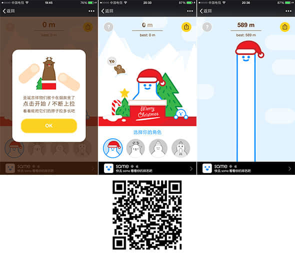
Sam launched an H5 small game called Santa Claus Rescue Plan at Christmas. The operation is very simple. Just slide up alternately with your fingers and pull the neck of the character up to an infinite length. The game will record the highest distance you pull and compare it with your friends. The interface is fresh and lovely, which is consistent with Sam's brand painting style. The game characters are also Sam's brand characters. Through humorous games, they convey Sam's unique and interesting product culture to users.
 3、 4 points for design
The outstanding design quality of an H5 page will directly affect its communication effect, and even affect users' perception of the brand image. The following design points are summarized here:
1. Details and Unification
To achieve a high-quality user experience, the unity of details and the whole must be taken into account. The visual style of retro imitations should not be too modern; The tone of humor and ridicule should not be too serious; The dynamic effect of playing emotional content cards should not be too fancy.
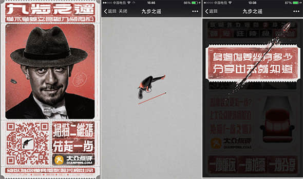
The public comments on the H5 special page of Jiang Wen's film promotion series, Nine Steps Away, firmly grasped this point. From the QR code entry to the sexy loading page, and finally to the design of sharing tips, including the wording of the text and the background sound effect, all are consistent with the overall theatrical style, giving users a complete and unified interactive experience.
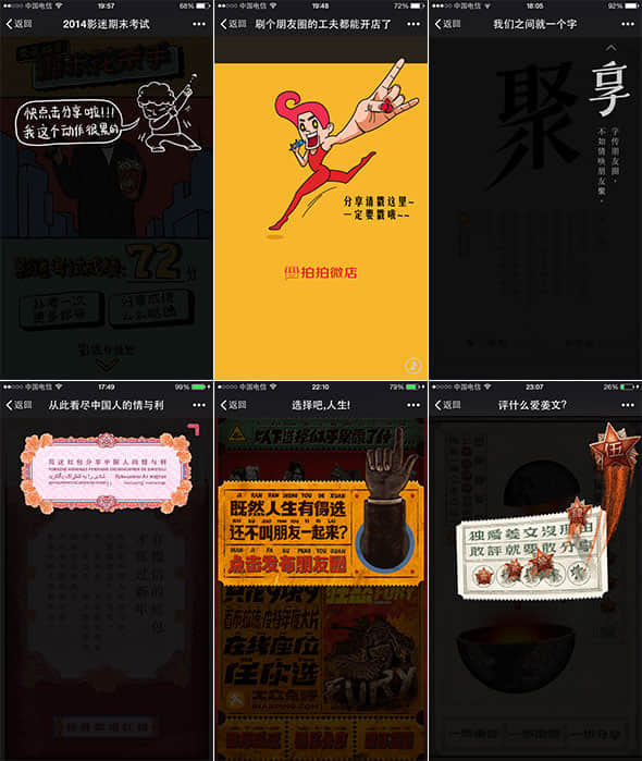
 Pay special attention to the detail design of "sharing tips". Compared with a simple arrow and a cold "click here to share", the quality and goodwill brought by careful detail design are obvious. Post some more wonderful cases:
 2. Keep up with the hot spots and use the topic effect
If you want your H5 topic page to become popular overnight, seize the hot spots and go online at the first time. Taking the opportunity to promote the brand is also a shortcut.
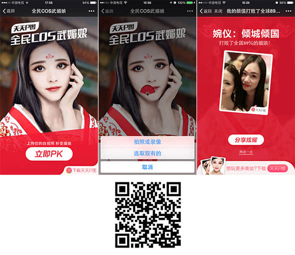
Taking the opportunity of Wu Zetian's popularity, Tiantianp launched the popular Meiniang makeup at home and abroad. At the same time, the H5 interactive page of All China COS Wumeiniang was also launched at the first time. The operation is simple and easy to use. One click to upload photos can immediately complete Meiniang makeup, and compete with thousands of Meiniang people, entertaining the public and promoting products.
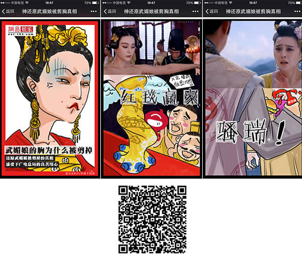
 NetEase Entertainment launched the H5 special page titled "God Restores the Truth of Wu Meiniang's Chest Cutting" on the cusp of the storm of Wu Meiniang's Chest Cutting, putting down integrity and using imaginative rough sketches to "restore" the truth to the audience. It was forwarded crazily for a while, and NetEase Entertainment also promoted itself.
 3. Tell a good story and arouse emotional resonance
No matter how changeable the form of H5 is, valuable content always comes first. In the limited space, learning to tell stories and arousing the emotional resonance of users will greatly promote the spread of content.
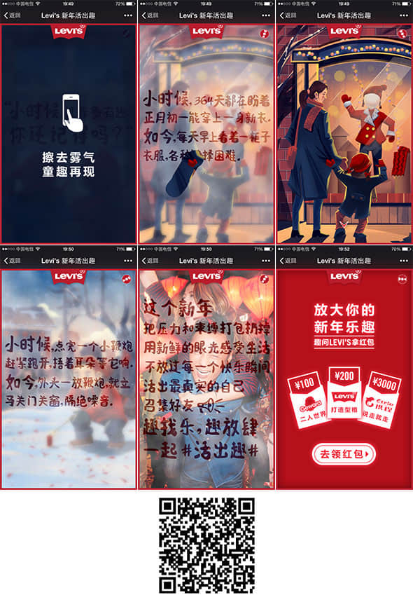
The special page of LEVI's New Year promotional activities uses the first person tone to contrast the simple but lively New Year when I was a child with the rich but boring New Year when I grew up, and uses hand painting style to render a kind nostalgic atmosphere. Finally, the brand promotion slogan of "this New Year, pack up and throw away the pressure and bondage, feel life with fresh eyes, and live happily together" is introduced. The story with strong sense of substitution is undoubtedly the driving force of sharing.
 4. Use technology reasonably to create a smooth interactive experience
With the development of technology, today's HTML5 has many outstanding features, allowing us to easily achieve interactive effects such as drawing, erasing, shaking, gravity sensing, erasing, 3D view, etc. Compared with the confusing and bloated pages caused by various dynamic effects, we advocate the rational use of technology and focus on providing users with a smooth interactive experience.
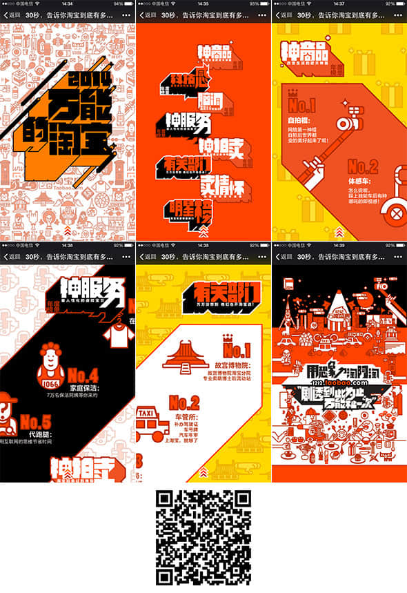
A typical case is the H5 special page of pre-sale promotion launched by Taobao on Double 12. In the browsing process, I only used a gesture of sliding upward, while the page presented a smooth dynamic GIF. The designer skillfully uses graphic design and combination to create a rich parallax rolling effect in the sliding process. The mask and rotation of a single graphic element are very compatible with the movement of the overall page.
 Shangpin China summary: With the upgrade of mobile phone hardware, the development of HTML5 technology, and the opening of WeChat platform, HTML5's advantages of cross platform, low cost, fast iteration, etc. are further highlighted, which will be the best era for business owners, brands, designers, and developers in the mobile Internet tide. More excellent H5 pages will emerge in the future, let's wait and see.
Source Statement: This article is original or edited by Shangpin China's editors. If it needs to be reproduced, please indicate that it is from Shangpin China. The above contents (including pictures and words) are from the Internet. If there is any infringement, please contact us in time (010-60259772).
