MENU service case
 Website construction website design Beijing website construction high-end website production company Shangpin China
We create by embracing change
360 ° brand value__
simplified Chinese character
Simplified Chinese English

Shangpin China Joins Hands with Beisheng Internet to Create a New Chapter in Website Construction

Type: Shangpin Dynamic Learn more

What are the important layout methods of website design now?
Source: Shangpin China | Type: website encyclopedia | Time: November 28, 2015
In the past decade, the Internet has undergone tremendous changes, but it has not changed at all. If we look at 10 years ago, we will find that a large number of websites have a common layout mode. Header, footer, sidebar, and content area, Beijing Website Design This is a straightforward layout. This is the expected web page layout. The rise of Macromedia Flash in the same period led other typesetting methods into a new era. Layout no longer has to adhere to fixed format. Of course, with the decline of FLASH, this approach has also faded out slightly... I say slightly, because it is now back.

Suppose you study a popular collection website, which shows the current web design. There is no doubt that you will notice that the basic structure of the web page is ever-changing, and there is no fixed form at all. It can scale and change into anything you need. I think this is the best by-product of responsive web design. In fact, there are no fixed rules for the new ones.

 Website design case 1
 Website design case 2
 Unconventional layout

To sum up, we can observe and find several major layout design trends, which can represent the unconventional layout I understand. They are unconventional because they do not strictly follow certain rules or established systems. But even if there are few hundred examples of this trend, I can find dozens of them and put them into these categories.

In this article, you will see an interesting hodgepodge of unconventional typography trends. I hope it can inspire you and help you conceive the basic structure of web design. Let's take a closer look

Based on module or grid

This case perfectly illustrates this point. The whole design is responsive. As the screen size changes, each module changes size to fit the space. Evenly dividing the screen makes the design easier to adapt. They also introduced some elements (in the large screen size) to break the constraints of module boundaries, which is the finishing touch.

Next, these layout methods are based on a modular or grid like structure. In these designs, each module tries hard to adjust according to the screen size. In fact, this is not a new way, but responsive web design makes it more useful. It implies an adaptive layout mode, which can be created from various module components like building blocks.

split screen

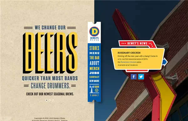
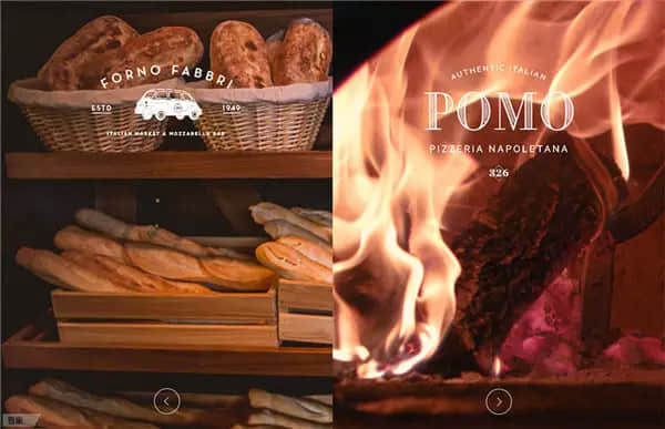
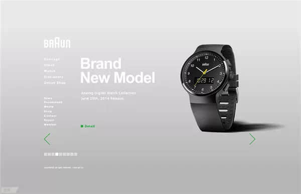
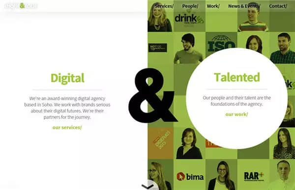
 Split screen website design case

In this category, our selected websites use vertical separators to split the screen. There may be many reasons for doing so. Through studying a large number of such cases, I found that there are two main points.

One reason is that sometimes there are two equally important main elements in a set of designs. The common method of web design is to sort the content according to its importance. Then the importance will be reflected in the level and structure of the design. But what if you just want to promote two things? This way, you can highlight the two and let users quickly make a choice between them.

The second reason is that sometimes you have to show an important duality. Take the Eight and Four website as an example. What they want to express here is that their core competitiveness comes from the digital field, as well as versatile employees. These two points have made them successful. It is a pleasant way to express this through screen segmentation.

De interface

 De interface

One of the main elements in web design is container elements: blocks, borders, shapes and all types of containers, which are used to separate content from the page. Imagine an old-fashioned page header, in which the elements just fit and are separated from the content. A common trend today is to remove all these additional interface elements.

This is a minimalist approach, but it goes one step further and brings about some interesting changes.

It can be found that after removing any sensory headers and footers, the content is greatly emphasized. You will see the company name first, then a clear description of their business content (and location), rather than the page header first. Then comes the main navigation. It's great to let users focus on the brand before browsing! It creates a beautiful visual process. Interestingly, when you scroll the page, the header and interface appear. Beautiful and effective typesetting, the use of this model is quite enlightening.
Source Statement: This article is original or edited by Shangpin China's editors. If it needs to be reproduced, please indicate that it is from Shangpin China. The above contents (including pictures and words) are from the Internet. If there is any infringement, please contact us in time (010-60259772).
TAG label:

What if your website can increase the number of conversions and improve customer satisfaction?

Make an appointment with a professional consultant to communicate!

* Shangpin professional consultant will contact you as soon as possible

Disclaimer

Thank you very much for visiting our website. Please read all the terms of this statement carefully before you use this website.

1. Part of the content of this site comes from the network, and the copyright of some articles and pictures involved belongs to the original author. The reprint of this site is for everyone to learn and exchange, and should not be used for any commercial activities.

2. This website does not assume any form of loss or injury caused by users to themselves and others due to the use of these resources.

3. For issues not covered in this statement, please refer to relevant national laws and regulations. In case of conflict between this statement and national laws and regulations, the national laws and regulations shall prevail.

4. If it infringes your legitimate rights and interests, please contact us in time, and we will delete the relevant content at the first time!

Contact: 010-60259772
E-mail: [email protected]

Communicate with professional consultants now!

  • National Service Hotline

    400-700-4979

  • Beijing Service Hotline

    010-60259772

Please be assured to fill in the information protection
Online consultation

Disclaimer

Thank you very much for visiting our website. Please read all the terms of this statement carefully before you use this website.

1. Part of the content of this site comes from the network, and the copyright of some articles and pictures involved belongs to the original author. The reprint of this site is for everyone to learn and exchange, and should not be used for any commercial activities.

2. This website does not assume any form of loss or injury caused by users to themselves and others due to the use of these resources.

3. For issues not covered in this statement, please refer to relevant national laws and regulations. In case of conflict between this statement and national laws and regulations, the national laws and regulations shall prevail.

4. If it infringes your legitimate rights and interests, please contact us in time, and we will delete the relevant content at the first time!

Contact: 010-60259772
E-mail: [email protected]