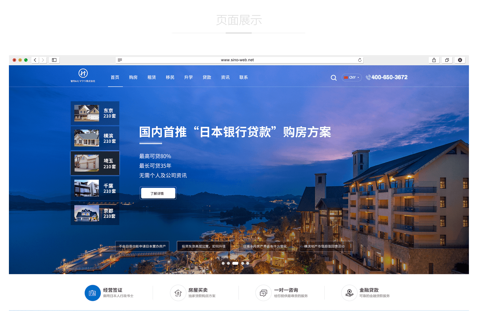
With the arrival of the information age, the network has become rich and colorful, but also improve people's aesthetic taste of the website. As the first visual language, color plays an important role in any design. Web page production must deeply understand and use color, and master the principles and methods of color selection and matching. below Website construction The company will give you a brief introduction.
First, some basic concepts of color
First, understand some basic concepts of color. There are many colors in nature. For example, roses are red, the sea is blue, and oranges are orange But there are three basic colors (red, yellow and blue), and other colors can be mixed from these three colors. We call these three colors "three primary colors".
Color in real life can be divided into color and non color. Black, white and grey belong to non color series. Other colors belong to colors. Any color has three characteristics: hue, lightness and purity. Among them, the non color only has the value attribute. Hue refers to the name of a color. This is the most basic feature of color and the most important factor that distinguishes one color from another. For example, purple, green, yellow, etc. represent different shades. Colors of the same hue can be easily matched by adjusting their brightness or purity, such as dark green, dark green, grass green and bright green. Brightness, also called lightness, refers to the brightness of colors. The greater the brightness, the brighter the color.
Brightness change and purity change
Purity refers to the brightness of color. The color with high purity is pure and bright. The purity of the bottom is dim and gray.
Similar color: three adjacent colors in the color ring. Yellow green, yellow and orange in Figure 2. The matching of similar colors gives a comfortable and natural visual effect. So similar colors are very common in website design.
Similar and complementary colors
Complementary color, two opposite colors in a color ring. For example, bright green and purple, red and green, blue and orange, etc. For complementary colors, it is sometimes a good match to adjust the brightness of complementary colors. Take blue and orange for example.. Is the matching effect better after adjusting the brightness of blue? Complementary colors are also widely used in website design.
Bus brightness level
Warm colors, orange, red and purple belong to the warm color series. The combination of warm color and black can achieve good results. Shopping websites, e-commerce websites, children's websites, etc. generally use warm colors., To reflect the dazzling array of goods, the lively warmth of children's websites, and so on.
Cool color, green, blue, blue purple, etc. All belong to cold color series. Generally, cold color and white can be mixed to achieve good results. Cool colors are generally used on some high-tech and game websites to express serious and stable effects.
Warm and cool colors
Color balance, the website makes people look comfortable and harmonious. In addition to the reasonable layout of text and other content, color balance is also an important part. For example, a website cannot use a single color, so the balance of colors is a problem that designers must consider. Color balance, including color position, proportion of each color, area, etc. For example, bright and bright color areas should be smaller to make people feel comfortable and not dazzling. This is a balanced color scheme.

Second, the association of colors
Color has rich feelings and meanings in people's life. For example, red is associated with roses, happiness and excitement. White is associated with purity, cleanness and conciseness; Purple symbolizes femininity, elegance and romance; Blue symbolizes high technology, steadiness and rationality; Orange represents joy, sweetness and harvest; Green represents youth, vigor, comfort, hope, etc. Of course, it does not mean that a certain color means something. In certain occasions, the same color can represent different meanings.
Third, the use of black, white and gray
Black grey is a universal color, which can be matched with any color. When you are worried about a certain color combination, try black, white and gray. When you think the two colors are not in harmony, try adding black or gray, which may have unexpected effects.
For some websites with high brightness, matching with black can reduce the brightness appropriately.
It is the most commonly used color in white websites. Many websites even leave a large blank space as a part of the website. This is the art of leaving blank. Many design websites use more white space art, which gives people a space to daydream and makes people feel comfortable and carefree. Proper white space plays an important role in coordinating page balance.
Fourth, determine the theme color of the website.
A website cannot use a single color, which makes people feel monotonous; But it is impossible to use all the colors on the website, which makes people feel frivolous and fancy. A website must have one or two theme colors, so that customers won't lose their way and won't be boring. Therefore, determining the theme color of the website is also one of the issues that designers must consider.
Try not to have more than 4 colors on one page. Using too many colors can lead to disorientation and inattention. After the theme color is determined, when considering other color schemes, you must consider the relationship between other color schemes and the theme color, and what kind of effect should be reflected. Which is the main factor, brightness, purity or hue?
Fifth, the elements of the page
I learned some basic concepts of color and some color matching problems, and applied them to the webpage. How to match the colors of various elements?
1. Background and text
If a website uses a background color, it must consider the combination of the background color and the foreground text. Generally, websites are dominated by text. You can choose the color with lower purity or lightness as the background, and the text uses more prominent bright colors. It is clear at a glance.
Of course, on some websites, in order to impress visitors, he will write articles in the background. For example, part of the blank page uses a large bright color block, does it make you suddenly enlightened? At this time, in order to attract the attention of visitors, the background is highlighted, so the text will appear darker, so that the text can be separated from the background to facilitate the visitors to read the text.
2. Signs and banners
Logo banner and LOGO BANNER are one of the most important parts of the promotional website, so they must pop up on the page. How to do this? Let's make the LOGO and BANNER brighter, that is, separate the color from the theme color of the page. Sometimes, in order to stand out, you can also use the color opposite to the theme color.
3. Navigation, subtitle
Navigation, the subtitle is the street light of the website. Visitors must jump from one page to another. In order to know the structure and content of the site, they must navigate the page or some subtitles. Therefore, we can use slightly jumping colors to attract the attention of visitors and make them feel that the website is clear, clear and hierarchical. No matter where you want to go, you won't get lost.
4. Link color setting
A website can't be just a single page, so text and image links are an integral part of the website. Here, we point out the links of words. Because links are different from text, the color of links cannot be the same as that of text. The pace of life of modern people is quite fast, and it is impossible to waste too much time looking for links to your website. Set a unique link color to make people feel different. Naturally, curiosity inevitably led him to move and click the mouse.


