6 important details for improving website design
Source: Shangpin China |
Type: website encyclopedia |
Time: December 21, 2013
The difference between excellent design and excellent design is relatively small. Ordinary people may not be able to explain the specific differences of excellent design, but they can find their favorite web design works. By comparing several excellent works, Website construction company Shangpin China summarized several details of outstanding design.
1. Use gradient properly
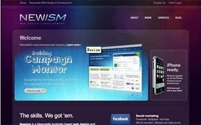
Don't abuse the gradient, let alone make it look like a rainbow, otherwise your web works will look unprofessional. In a word, proper use of gradient is helpful for good website design. The combination of gradient and casual scene uses Newism website with rich colors, but the subtle gradient and background are visually combined in place. If you are also interested in doing this casual effect in Photoshop, you can go to Abdulzeedo's tutorial website to learn about it.
 Gradient, projection and texture are used together.
OnWired uses these design techniques. Obviously, his design works are very effective! OnWired website design is just right in terms of gradient, projection and texture. I also particularly like these designed by designers.
2. Leave blank
The word "left blank" is often misunderstood and interpreted literally. The more accurate description of web page design is the space range between each element of the web page. Take a closer look at how A List Apart defines it.
"Leave blank" is very important for web page design. Leave blank so that your page elements will not stack together. It may be a big problem for young designers to leave blank. When they design, they fill the whole page, not giving enough "breathing space" to the page. This may not be a problem for them. If the content cannot be put down, they can use the browser's scroll bar to expand the page space.
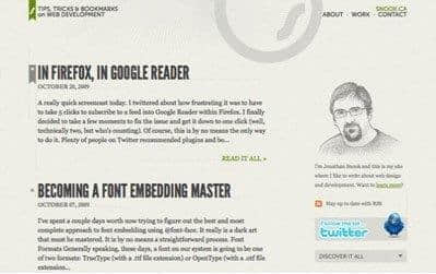
Excellent blank space and clever dividing line
Snook website layout is designed reasonably and comfortably. At the same time, notice that the dotted lines in the website distinguish each section, so that we can see it clearly when we browse the website.
 Abstract figure
The sofa adopts an abstract, beautiful and simple method. By using images without background or clutter, the space for visitors is smooth and comfortable.
3. Grid Layout
The grid layout of web design was originally inspired by the layout of newspapers. But if you carefully observe the things around you, you can find grid phenomenon, from good design to traffic network in life.
960 and Blueprint are probably the two most popular grid layouts. Personally, I prefer 960 grid layout, which is simple and focused. You can use any alignment method to arrange the elements of your website. When designing a complex page, alignment can make your website look more refined and orderly, and when you add any module content in the page layout, you don't need to consider other module content.
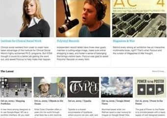
 Comprehensive use of grid layout
Poccuo website comprehensively uses grid layout, which uses a combination of three columns and five columns. Give people visual attraction and visual space.
Ecoki's beautiful web page layout obviously adopts a 4-column, 2-line layout. At the same time, slides, thumbnails, and the latest review also adopt the same way.
4. Simplify complexity
Don't show all the functions or columns on the surface. We should make "rich inside, simple outside". The simpler the "skin", the more suitable for users to operate. Rich functions and content can be accessed reasonably through links! And recently, the "light blog" appeared after Weibo.
From my long-term use of microblog, I have observed that light blog is gradually accepted and used by users. I'm not sure whether this can replace the "heavyweight" blog in the future, but one thing I really appreciate is that it does not carry any advertising with slogans popping up. A clean interface is the first impression. It seems reasonable and believable. It meets the simple standard.
This kind of product between the official blog and the fragmented microblog is reflected in the result between the seriousness of thinking and broken thoughts. There is no need to pay too much attention to the preciseness of writing articles and the randomness of microblogging. Blogs are too rigorous. People who write them are very heavy, and people who watch them will be boring. However, microblog is too casual. People who write are producing garbage, and people who watch it will feel bored. Light blog is to intercept the essence, but it cannot be regarded as a formal text.
By analogy, from the Internet to commodities to buildings and games, excellent products are often extremely simple and easy to understand.
5. Page icon - enhance the beauty of the page
Many people say that design strives for details, and the details expressed in web design are icons. Icons bring additional annotations to a design and bring objects and elements in the design to the user's attention. Some designers don't like using icons very much, and they think it is meaningless. They say that I can achieve the effect of icons with words, and can improve the speed of website browsing without icons. In fact, today's Internet speed has been greatly improved, and the volume brought by web icons has been completely negligible, but the visual effect brought by icons to web design is unmatched by words.
6. Don't use too many colors
Marketing website construction Colors are not randomly matched, but are "designed" according to the theme or industry characteristics of the website, the VI system of the website and other comprehensive factors. People often do not agree with the meaning of some specific colors and what colors designers should use to enhance specific emotions. But there is no need to argue that customers have emotional reactions to colors. Be careful when choosing colors for your designs. Don't use colors aimlessly. The color you choose should be suitable for your target audience, be able to express the information that customers want you to convey, and meet your expectations for the overall feelings of users on your website.
We generally recommend using a main color (which can be two color gradient or one color gradient) as the main color of the web page, and using one or two colors as the secondary color to complete the color design of the entire web page!
Source Statement: This article is original or edited by Shangpin China's editors. If it needs to be reproduced, please indicate that it is from Shangpin China. The above contents (including pictures and words) are from the Internet. If there is any infringement, please contact us in time (010-60259772).
