How to use website user experience to increase seo effect
Source: Shangpin China |
Type: website encyclopedia |
Time: 2015-05-15
To mix, image is very important. Mixed with the Internet, image is the first barrier that determines your life and death. No matter how rich the content of a website is, if the image is too poor, the Internet is doomed to fail to survive in the shallow attention flooding.
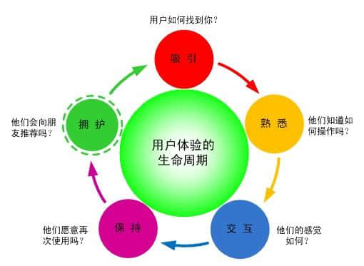
Just ended 2014 SEO website optimization At the sharing conference, Shangpin China When it comes to the future of SEO, improving user behavior will increase the weight in the ranking algorithm of search engines, that is, bounce rate, dwell time, PV volume and other indicators.
Of course, this not only refers to Baidu, but all search engines. In fact, a really good website optimization should not focus on which search engine, but on the needs of users. In fact, the search engine hopes to focus more on the improvement of user experience by increasing the weight of this user indicator.
So, how should these user indicators be improved? There are a variety of methods. Here is an optimization idea that is easiest to achieve.
This idea is based on the previously mentioned Website production The image is unfolded. A good website image often allows users to stay for a while and open several pages. However, what we need to mention here is not only the good look of the website, but also more image improvement, mainly from the following aspects.
1. The overall website structure should avoid "parallelism"
After the first screen catches the eye, most people will first browse the whole website and drag it down to see what the website says in general. Although the area below is relatively large, what you must avoid is the flat presentation of the website. The "parallel" board structure is easy to cause fatigue, because it makes the eyes unable to land.
Therefore, although the area below the first screen is relatively wide, there should be a sense of hierarchy. Generally, the more important information is displayed on the left, the more important information is displayed on the right. In this way, users can find what they need at once and click it again.
2. The first screen should focus on the eyes
Generally, websites can't be displayed in one screen, and the website displayed in one screen gives people too thin impression. This first screen plays a role of first impression on the website phenomenon, so it is necessary to catch the attention of visitors at the first time.
First of all, the first screen should not be dense. Don't think that the first screen will bombard the user's eyes with a lot of information, which will drive the user away. Try not to show the following items on the first screen: a. Segmented text; b. Text list; c. More than three colors; d. Drop down box.
In fact, there are four necessary elements in the first screen: logo, search box, navigation bar and big theme. With these four things, others can be added as appropriate. The general principle is simple and generous, guided by induced clicks, and not showing too much practical information, especially not too many words. This is the trend of website design.
3. Use pictures to induce clicking
Attention economy can only survive if it can attract attention, so the significance of pictures is particularly significant. Even a website like Huxiao, which focuses on in-depth reviews, will carefully select pictures to enhance the visual effect of the website. "No picture, no truth" is a very disappointing sentence on the Internet.
Therefore, it is recommended to increase the proportion of images on the overall website, and use large images and small images together. In particular, the use of small images does not interfere with technical issues such as loading speed, and makes the website look more attractive. The list form of "small picture+title" on the home page will be a very attractive scene.
4. Let the title of the home page be more "title party"
The title on the front page accounts for a large proportion, and there are few paragraphs of text. The number of titles that can appear on the home page is limited. Therefore, these titles should not be allowed to occupy the laissez faire. Don't appear mediocre and boring titles. Otherwise, the "click rate" of the overall page will decrease, the number of visitors arriving at the inside page will decrease, and the natural PV volume, dwell time and other user indicators will decline.
Therefore, the title of the home page should be carefully designed. So far, keyword layout oriented titles are not recommended to be used in large numbers, but inductive titles should account for a large proportion. The biggest contribution of the home page title should be to make the overall image of the home page fresh and interesting, highlight the brand characteristics, rather than the layout of keywords.
5. Don't be too enthusiastic about website interaction
There are often two kinds of sales that make people crazy: one is loud, the other is too talkative. These two kinds of sales are "violent" sales, which is difficult to conquer customers. The manual or robot customer service of the website is equivalent to the sales of the website. It is better not to be too proactive. The nature of the Internet is more user oriented. After reading it, users will ask questions about what they don't understand and what they need.
So, just make sure that your customer service is always ready at the place where it is easy to see. Don't always pop up and hover back and forth in the whole screen. In fact, pop-up and levitation can be abandoned.
6. Slim the typesetting
If your visitors are lucky enough to be able to go deep into the article page, it is gratifying, but it is also stressful, because the dwell time of the detail page has a greater impact on the SEO effect, and the dwell time of the general detail page should be the longest.
Therefore, the text layout of the details page should not make people want to run away at a glance. What makes people lose confidence at first sight is that there are no subtitles, large paragraphs of text, text is too small, text is too long these basic errors, so it is necessary to lose weight for articles. The way to lose weight is to improve on these basic mistakes. The big and small titles are embedded in them, multi segmented, and font size is more than 14. As for the length, it depends on the quality of the content.
In addition, it is recommended that the article page be interspersed with several pictures, and the mixed arrangement of pictures and texts is the basic requirement of online texts.
The above mentioned points can make users behave better on the website, and make the website become a good website in the eyes of search engines. In fact, these practices can be understood as "implicit internal chain construction", which are all efforts to improve the depth of access. The current search environment has put forward higher requirements for SEO people, not only playing with dead keywords and smart technical means, but also facing users more and connecting with their needs.
Source Statement: This article is original or edited by Shangpin China's editors. If it needs to be reproduced, please indicate that it is from Shangpin China. The above contents (including pictures and words) are from the Internet. If there is any infringement, please contact us in time (010-60259772).


