MENU service case
 Website construction website design Beijing website construction high-end website production company Shangpin China
We create by embracing change
360 ° brand value__
simplified Chinese character
Simplified Chinese English

Shangpin China Joins Hands with Beisheng Internet to Create a New Chapter in Website Construction

Type: Shangpin Dynamic Learn more

How to Make Rounded Border in Website Making Tutorial
Source: Shangpin China | Type: website encyclopedia | Time: April 22, 2015
Some techniques are often used in making web pages, such as adding rounded corners around the table, which can avoid using the right angles of the table directly and seems too rigid. Many netizens have mentioned the solution. We choose the most representative two methods to reproduce the rounded corners of the table Website production Process.

The first production method:

1、 Advantages of CSS3 fillet
Traditional fillet generation scheme must use multiple pictures as background patterns. With the advent of CSS3, we no longer have to waste time making these pictures, and there are many other advantages:

*Reduce maintenance workload. The generation, updating of image files, and writing of web code are no longer needed.
*Improve web performance. Since there is no need to send redundant HTTP requests, the web page will load faster.
*Increase visual reliability. In some cases (network congestion, server error, slow network speed, etc.), background images will fail to download, resulting in poor visual effects. This will not happen to CSS3.

2、 Border radius property
CSS3 fillet only needs to set one attribute: border radius (meaning "border radius"). If you provide a value for this attribute, you can set the radius of four fillets at the same time. All legal CSS measures can be used: em, ex, pt, px, percentage, etc.
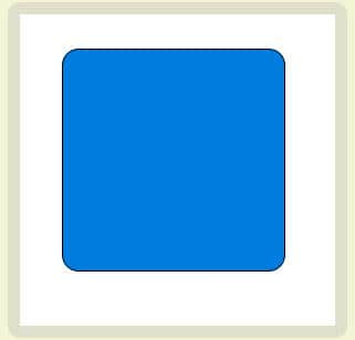
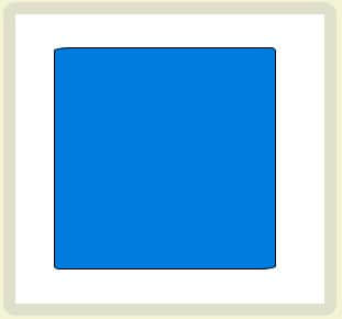
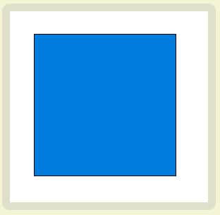
For example, the following is a div box:

 Div box

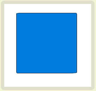
Now set its fillet radius to 15px: border radius: 15px;


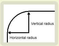
This statement sets the horizontal radius and vertical radius of each fillet to 15px at the same time.


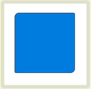
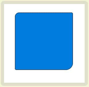
Border radius can set 1 to 4 values at the same time. If 1 value is set, it means that all 4 fillets use this value. If two values are set, the upper left and lower right corners use the first value, and the upper right and lower left corners use the second value. If three values are set, the upper left corner uses the first value, the upper right corner and lower left corner uses the second value, and the lower right corner uses the third value. If four values are set, they correspond to the upper left corner, the upper right corner, the lower right corner, and the lower left corner (in clockwise order).

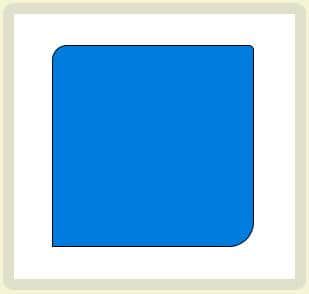
border-radius: 15px 5px;


border-radius: 15px 5px 25px;


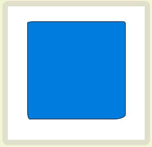
border-radius: 15px 5px 25px 0px;


(When the radius of the lower left corner is 0, it becomes a right angle.)
Border radius can also set the second set of values with a slash. At this time, the first set of values represents the horizontal radius, and the second set of values represents the vertical radius. The second group of values can also set 1 to 4 values at the same time. The application rules are the same as the first group of values.

border-radius: 15px 5px / 3px;


border-radius: 15px 5px 25px / 3px 5px;


border-radius: 15px 5px 25px 5px / 3px 5px 10px 15px;


Browser support:
IE 9, Opera 10.5, Safari 5, Chrome 4, and Firefox 4 all support the above border radius attribute. Earlier versions of Safari and Chrome support the - webkit border radius attribute, and earlier versions of Firefox support the - moz border radius attribute.
At present, to ensure compatibility, you only need to set - moz order radius and border radius at the same time.
  -moz-border-radius: 15px;
  border-radius: 15px;
(Note: border radius must be declared at the end, or it may become invalid.)
In addition, the statements with single rounded corners in earlier versions of Firefox are slightly different from the standard grammar.
*- moz order radius topleft (standard syntax: border top left radius)
*- moz border radius topright (standard syntax: border top right radius)
*- moz border radius bottomleft (standard syntax: border bottom left radius)
*- moz border radius bottomright (standard syntax: border bottom right radius)

The second production method:
 
1. Make two pictures with rounded corners. You can first make one picture of the two pictures, and then use Photoshop software to flip it vertically.
2. Insert a table with the same background color as the picture between the two pictures. The length is also set to the length of the picture. Set the cell spacing of this table to 1, and the rest to 0.
3. Set the cell background color of the table to white (it can be seen from steps 2 and 3 that a table with thin line borders has been created here)
4. Finally, we can fill in the table. We can copy and paste this part as a whole to different places on the page. Of course, you can also change the size of the entire rounded table. What we need to do is to change the size of the rounded image and the inserted table.

The codes are as follows:
 

//ihucc.com/uploadfiles/20060823094159.gif " width=125>

Note: In fact, it is a combination of two round corner pictures and a thin line table.

The third production method:
 
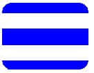
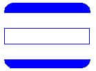
1. Preparation: make two pictures of small round corners, as shown in the right figure. You can make one first and then flip it with relevant software
2. Make a table with one row and three columns. The cell spacing, cell margin, and border of the table are set to zero. The default width is 100%, or it can be set to a fixed width. In this example, it is set to 150 pixels.
  3. Click the "Show/Hide Guidelines" button, and insert the two small pictures in the first step into the first and third cells respectively. Then select the small picture on the left, press the left arrow key, and finally press the backspace key to delete a space in front of the small picture.
  4. Set the horizontal alignment of the first cell to be left aligned, the vertical alignment to be top aligned, so that the picture is on the top left of the cell, the horizontal alignment of the third cell to be right aligned, and the vertical alignment to be top aligned, so that the picture is on the top right of the cell.
  5. Set the background color of each cell (note the cell) to the same color of the inserted picture.
  6. Insert a thin line table with the same border color below, and now you can write content in the thin line table.

The codes are as follows:


Does this form look familiar? Indeed, we can find it on many big websites.

Note: It consists of two separate tables, the first of which is the key to the appearance of rounded corners.
Source Statement: This article is original or edited by Shangpin China's editors. If it needs to be reproduced, please indicate that it is from Shangpin China. The above contents (including pictures and words) are from the Internet. If there is any infringement, please contact us in time (010-60259772).
TAG label:

What if your website can increase the number of conversions and improve customer satisfaction?

Make an appointment with a professional consultant to communicate!

* Shangpin professional consultant will contact you as soon as possible

Disclaimer

Thank you very much for visiting our website. Please read all the terms of this statement carefully before you use this website.

1. Part of the content of this site comes from the network, and the copyright of some articles and pictures involved belongs to the original author. The reprint of this site is for everyone to learn and exchange, and should not be used for any commercial activities.

2. This website does not assume any form of loss or injury caused by users to themselves and others due to the use of these resources.

3. For issues not covered in this statement, please refer to relevant national laws and regulations. In case of conflict between this statement and national laws and regulations, the national laws and regulations shall prevail.

4. If it infringes your legitimate rights and interests, please contact us in time, and we will delete the relevant content at the first time!

Contact: 010-60259772
E-mail: [email protected]

Communicate with professional consultants now!

  • National Service Hotline

    400-700-4979

  • Beijing Service Hotline

    010-60259772

Please be assured to fill in the information protection
Online consultation

Disclaimer

Thank you very much for visiting our website. Please read all the terms of this statement carefully before you use this website.

1. Part of the content of this site comes from the network, and the copyright of some articles and pictures involved belongs to the original author. The reprint of this site is for everyone to learn and exchange, and should not be used for any commercial activities.

2. This website does not assume any form of loss or injury caused by users to themselves and others due to the use of these resources.

3. For issues not covered in this statement, please refer to relevant national laws and regulations. In case of conflict between this statement and national laws and regulations, the national laws and regulations shall prevail.

4. If it infringes your legitimate rights and interests, please contact us in time, and we will delete the relevant content at the first time!

Contact: 010-60259772
E-mail: [email protected]