Website color matching tutorial (classic)
Source: Shangpin China |
Type: website encyclopedia |
Time: 2016-05-08
in the capacity of Website production As a novice, are you still struggling to find a perfect color scheme for the pages you make? In this tutorial, we will share with you 6 guidelines that are sure to be hot and "can't be wrong". You can grasp the most basic color rules according to these guidelines. These principles we share are not rules. You will create more color schemes in your career. On the contrary, they are a starting point and a safe guide to how you can survive in the field of web design.
1、 It is your canvas, not your picture, that needs color matching
One of the most fundamental principles in web design is that no matter how much time you spend creating a brilliant design, its ultimate role is to play the core role of content. Your color scheme should never be more "loud" than what it presents. Your design should be in the background to help highlight the content of the website.
 A light canvas highlights the image, while a bright canvas does not highlight your content. (Don't laugh. The latter is a real case on the Internet.)
When designing websites with Photoshop or Sketch and other software, the process of creating designs is often independent of each other. Some designs look good and can be accepted by your customers, but when they are really designed as web pages, improper color matching will often distract visitors. In fact, the process of web design is closely linked to content. Many high-quality web pages look empty and almost have no content.
This is a great idea: you can first display your content on your website, use design software or code, and then design your web page around your content. Of course, this is also a special case. If a specific style of images and photos can be integrated with your design in harmony, then your design color matching is perfect. Imagine that the color matching of a website is just like the importance of clothes to people for content, for which you must develop a perfect and suitable suit.
2、 Choose simple grey as the keynote of your website
You can choose countless colors for your website tone, but I suggest you use the simplest color, such as white/light gray and dark gray with text background.
You can look at any popular website, template, theme. White or light gray and dark gray are most of the choices, which of course has good reasons. This kind of collocation improves the readability of your content for visitors, and highlights your pictures in the front.
 Generally speaking, you'd better avoid using black ink for your text. Dark gray is generally easier to read. We provide a more comfortable text color range: # 333333 to # 666666. For your background color, full white (# FFFFFFF) is the safest color that can match any text. If you want to use other background colors, we recommend using # FFFFFF to # CCCCCC Of course, these color choices are not fixed. But if you are a novice, you can use the above color scheme with confidence.
3、 Select only one color to highlight
If you choose several different colors, most of your color scheme is problematic. The more colors you use, the more difficult it is to control your page. Therefore, on the premise that your website has a gray tone, you'd better choose only one bright color as the thing you want to highlight, such as the title, menu, button, etc. Your highlight color can be blue, red, green, etc.
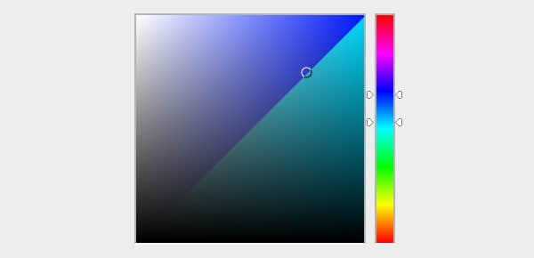
You'd better choose the highlight color related to your tone color. Open your Color Selector and click the center of your color square.
 Move your slider up or down, and you can carefully select the color you think is most suitable.
 Now, the page you designed has three basic colors: background color, text color and high light color. You can also choose more than one highlight color in the future, but now it is more appropriate for novice users to choose one. Now that you have mastered the basic color matching, if you are confident, you can try more different schemes in the future.
You just learned:
Learned how to choose "hue". Generally speaking, hue is the basic color. When you move the slider, you will see the change of h value in the color selector.
"H" stands for hue. Once you select your highlight color, the hue of your current color will be displayed in the text box.
4、 If in doubt, use blue
If you have doubts about your choice of highlight color, you may as well use blue. Blue is a color with great elasticity, which can be matched with many colors. Yellow and purple are also good, but they can be counterproductive if used improperly.
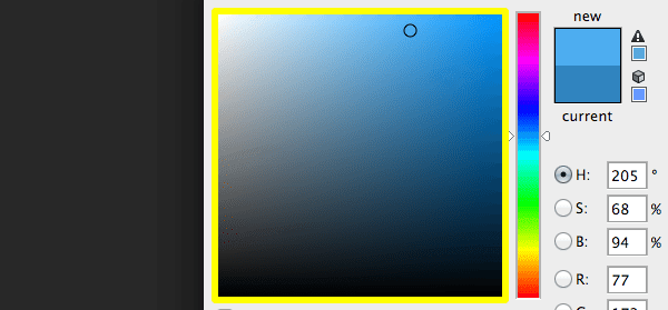
On the other hand, if you use blue, the probability of using the wrong color will be very low. If you are hesitating about what color to use, you might as well use blue. The safer blue includes H235 to H190, navy blue to dark blue.
 If it's me, I usually choose H205 blue. If you choose a color as your highlight color, please also use this color in other places where you need it. If your buttons, titles, etc. need to be highlighted, change their color to the same blue. In the following example, I changed white to blue.
5、 Add variety to your highlights
 Once you have selected the highlighted color, move the slider from that point to select the next color. You also need other colors in your design. A slight change in the highlight color will make your color selection easier.
Use these types of color variations, such as:
Hover effect:
 Boundary:
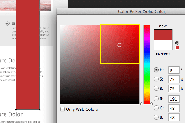
 6、 Try not to use the color in the upper right corner of the color selector
The upper right corner of the color selector is a fertile land. The color in the upper right corner is like an F1 car; They can perform amazing results and are very attractive, but it usually requires a lot of experience to use them well. If there is no such experience, they may lead to accidents, so it is better to weaken your color, and it is better to keep the color relatively weak.
This is why in the third part of this tutorial, I asked you to make sure that you have a soft color to start before selecting your highlight color in the center of the upper right corner of the map.
To illustrate this point, let's see what will happen if I just change the color of our design so far.
Blinding the visitor's eyes every minute! If you want to make sure you don't scorch your visitor's retina, follow the rule of leaving half of the space in the upper right corner of the color selector.
Saturation and brightness
 When you drag the map area of the surrounding color selector area, you will see that the values of "S" and "B" change, which represent saturation and brightness. You can also see that the hue number remains unchanged. Therefore, you can change the color by changing the saturation and brightness of your original hue.
saturation
It is a vivid color expression. For example, think "my shirt is permeated with wine red". In a typical color selector, how much white the saturation is is determined by mixing the hue in your base. The less white, the more saturated.
When you drag the color to the right on the map, you can reduce the amount of white, thus increasing the saturation, and the value of "S" rises. When you drag all the white corners to the left, you will reduce the saturation and make the value of "S" drop.
 brightness
Brightness is how much black is mixed into your color. The less black, the brighter.
When you drag the slider up, you reduce the number of black, increase the brightness, and the value of "B" in the color selector rises.
Black mixed with your original tone is also called "shadow". This also comes from paint mixing, which is the mixing of black paint and paint color.
When you mix gray to color this is called creating a hue. If you adjust the saturation and brightness, you create a hue. So basically no matter your saturation and brightness are less than 100% at any time, this is a hue.
Similarly, the word comes from paint mixing, in which a gray paint is created and then mixed with colored paint.
Monochrome color scheme
 The monochrome color scheme is that you use a basic hue and expand its hue, saturation and brightness. So, by picking the color of a bright spot and the changes it creates, you actually create a monochrome scheme.
Conclusion: Keep practicing the monochrome color scheme based on grayscale until you feel confident. Try to use different hues, try to create different highlights, and see how it changes the saturation and brightness settings until you can use them.
When you feel comfortable, you can add an extra highlight color. I suggest trying orange and blue, because they are often the simplest duets. Then try green and blue, which is the second simplest in my experience. These two are often praised by customers and visitors.
In order to promote your understanding of the color scheme of the Web, the best thing is to catch your favorite color. You can use the sampler (browser extension Colorzilla) to study how experienced designers achieve rich color matching. When you are browsing the Internet, you see a big breakthrough. You can use the color sampler to see the color scheme of the colors used on the page. You can even try each hue to see which saturation and brightness levels work best. In addition, pay attention to the harmony of its color combination.
If in doubt, you can always return to your "safety first" guideline, which is not wrong in any case.
Source Statement: This article is original or edited by Shangpin China's editors. If it needs to be reproduced, please indicate that it is from Shangpin China. The above contents (including pictures and words) are from the Internet. If there is any infringement, please contact us in time (010-60259772).

